Preview image. Unlock full-res
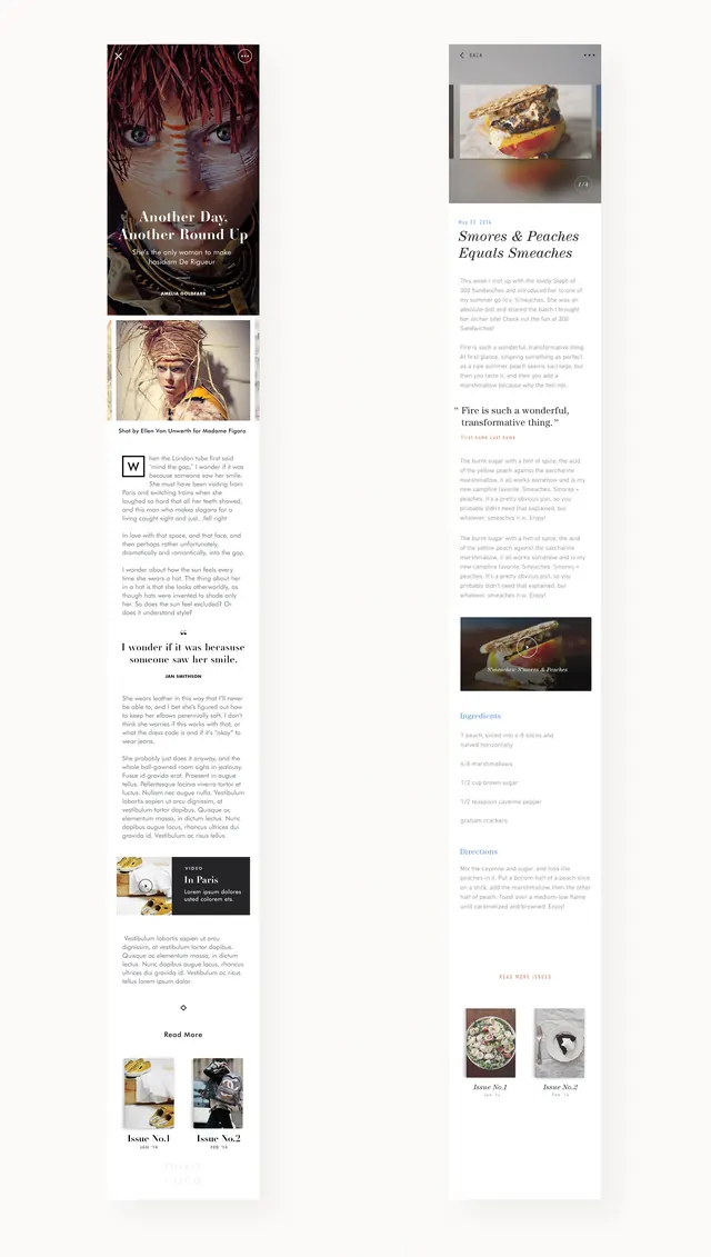
A side-by-side comparison of two vertical editorial layouts featuring photography, typography, and structured content blocks.
Summary
A side-by-side comparison of two vertical editorial layouts featuring photography, typography, and structured content blocks.
Visual description
Two vertical columns showing different arrangements of serif and sans-serif text paired with rectangular photographs. The left side uses a more dense, structured grid while the right side features more white space and larger image headers.
Key takeaway
Demonstrates how varying white space and image placement can shift the visual weight of an editorial layout.
Reuse notes
Use as a reference for balancing text density and imagery in magazine or portfolio designs.
More like this
Keep what you find
A free account saves references to boards and can send you a weekly email of picks based on what you save.
To see every result, go Pro.