Preview image. Unlock full-res
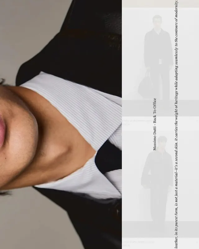
Magazine-style split layout with a portrait photo on the left and faded figure silhouettes with vertical text on the right.

Summary
An editorial magazine spread with a striking split-screen layout: a cropped portrait photo on the left contrasts with subtle silhouettes and vertical serif text on the light right panel.
Visual description
Left half displays a close-up photograph of a figure's torso wearing neutral tones with white ribbed fabric. Right half is a light gray background with three faded silhouettes of full figures and vertical serif text running down the edge in small caps, creating a sophisticated editorial composition.
Key takeaway
The effective use of a split layout to balance photography with typography and negative space. The vertical text orientation frames the page without competing visually. The muted color palette unifies both sides.
Reuse notes
Strong reference for fashion, lifestyle, and editorial design layouts. The horizontal split works well for creating visual balance between bold imagery and contemplative text. Pairs well with serif typography and minimal color palettes.
More like this
Keep what you find
A free account saves references to boards and can send you a weekly email of picks based on what you save.
To see every result, go Pro.