Preview image. Unlock full-res
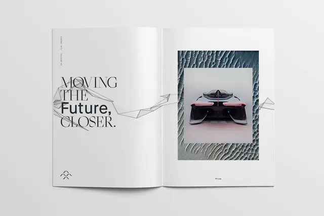
An editorial spread showcasing minimalist typography saying "Moving the Future Closer" paired with a dramatic futuristic vehicle image.
Summary
An open magazine or portfolio spread with minimalist layout: typography reading "Moving the Future Closer" on the left page, paired with a striking image of a futuristic black vehicle with red accents on the right.
Visual description
A two-page editorial spread shows a clean, minimal design. The left page features large sans-serif typography reading "MOVING the Future CLOSER." in mixed sizes and weights, with an organic line illustration beneath. A small diamond icon sits at the bottom. The right page displays a framed photograph of a sleek, aerodynamic black vehicle with red/neon accents, featuring dramatic lighting and what appears to be angular, futuristic design. The frame has a textured border suggesting a rope or cord. The overall palette is predominantly light gray and white with dark navy accents, creating high contrast. The layout uses generous white space and restrained typography.
Key takeaway
Strong combination of bold typography with striking product imagery creates visual hierarchy. The tagline "Moving the Future Closer" pairs well with the futuristic vehicle, creating narrative cohesion. Minimalist layout with strategic contrast draws attention to key elements.
Reuse notes
Excellent for tech, automotive, or innovation-focused design portfolios. The forward-thinking messaging suits companies positioning themselves as visionary or cutting-edge. The restrained color palette and Swiss-style typography convey professionalism. The large typographic element is reusable across marketing applications. Designer appears to be Yuji Sakuma based on the portfolio domain.
More like this
Keep what you find
A free account saves references to boards and can send you a weekly email of picks based on what you save.
To see every result, go Pro.