Preview image. Unlock full-res
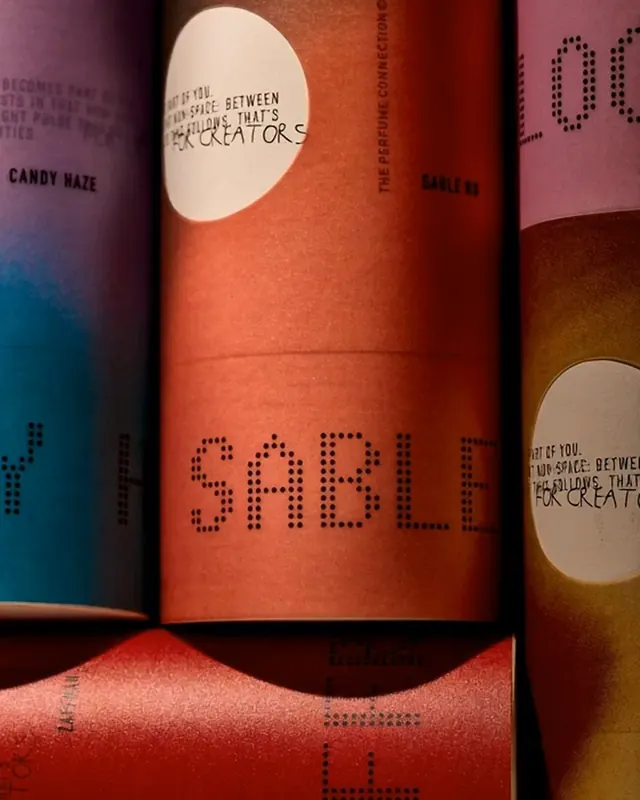
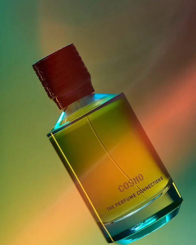
Luxury perfume branding and packaging with prismatic glass aesthetics, featuring a custom dotted wordmark, bold color gradients, and art direction centered on light and material.

Summary
A complete luxury perfume brand system centered on color, light, and material: jewel-toned glass bottles with precision typography, custom dotted wordmark, and a color palette ranging from deep saturated hues to bright citrus accents. The stills show packaging evolution and the brand's structural design language.
Visual description
Frame one displays fragrance bottles photographed at an angle: ruby glass catches light, showing warm reds and oranges alongside cooler purples and blues in a gradient. A white circle with dotted type sits prominent on the bottle. Subsequent frames reveal the color system in application-on packaging labels with precision typography, on design explorations mixing black backgrounds with neon citrus accents, and on bottle caps that shift between matte and reflective finishes. Small geometry dots repeat throughout as a graphic motif. The light treatment is intentional: every shot emphasizes how the glass refracts and reflects, making materiality a core design element.
Key takeaway
The use of a single dominant custom mark (the dotted wordmark) as the system's anchor, allowing color and material to drive the rest of the design. The color rhythm strategy-deep jewel tones with shocking neon accents-creates luxury without excess. The precision of geometric elements (dots, grid lines) prevents the vibrant palette from feeling chaotic. The emphasis on how light interacts with glass is a material-forward approach to luxury.
Reuse notes
Excellent model for luxury goods branding where material quality and light play are integral to perceived value. The dotted/geometric wordmark language works best in premium applications and pairs naturally with saturated color gradients. The dark packaging backgrounds keep it refined; would not scale to minimalist all-white designs. Best for fragrance, cosmetics, or liquor branding. The scale of the white circle mark can be adjusted for different applications but should remain a focal point.
From this post: TPC Perfumes branding and packaging system
View post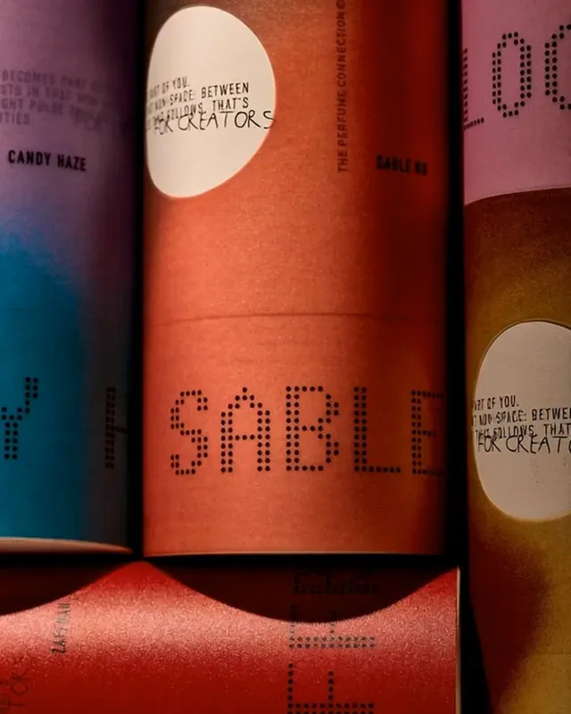
More like this

Keep what you find
A free account saves references to boards and can send you a weekly email of picks based on what you save.
To see every result, go Pro.