Preview image. Unlock full-res
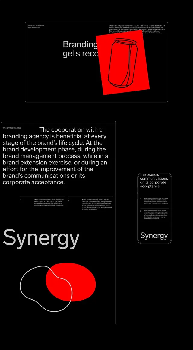
A dark branding presentation spread uses oversized white typography, thin outline frames, and a vivid red graphic accent.
Summary
A dark branding presentation spread uses oversized white typography, thin outline frames, and a vivid red graphic accent.
Visual description
The image shows a black-background branding layout with a large framed section at the top, a bigger text-heavy section below, and a narrow mobile-style mockup on the right. White sans-serif headlines and small body copy sit inside thin gray outlines, while a tilted bright red rectangle with a black line drawing of a can overlaps the upper panel and a red oval overlaps a white outlined organic shape near the bottom.
Key takeaway
Use oversized typography against lots of negative space, then puncture the calm with one saturated accent shape that overlaps the grid. Thin outline frames and tiny labels can make the whole composition feel like a structured branding system.
Reuse notes
Reach for this when you want a brand case-study page, manifesto slide, or editorial promo that needs to feel sharp and premium. It works best when the content is mostly text and a single bold graphic element can carry the visual tension.