Preview image. Unlock full-res
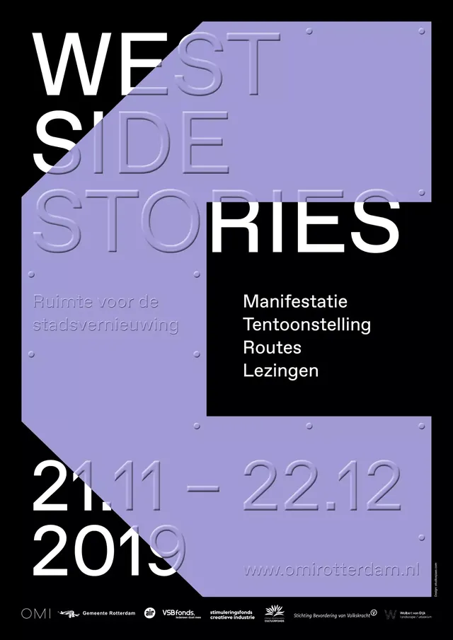
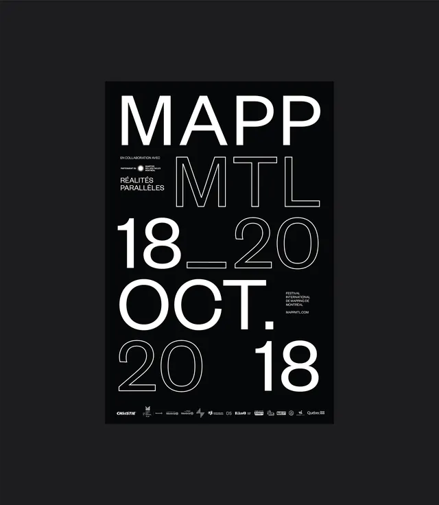
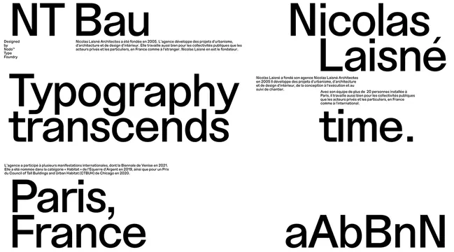
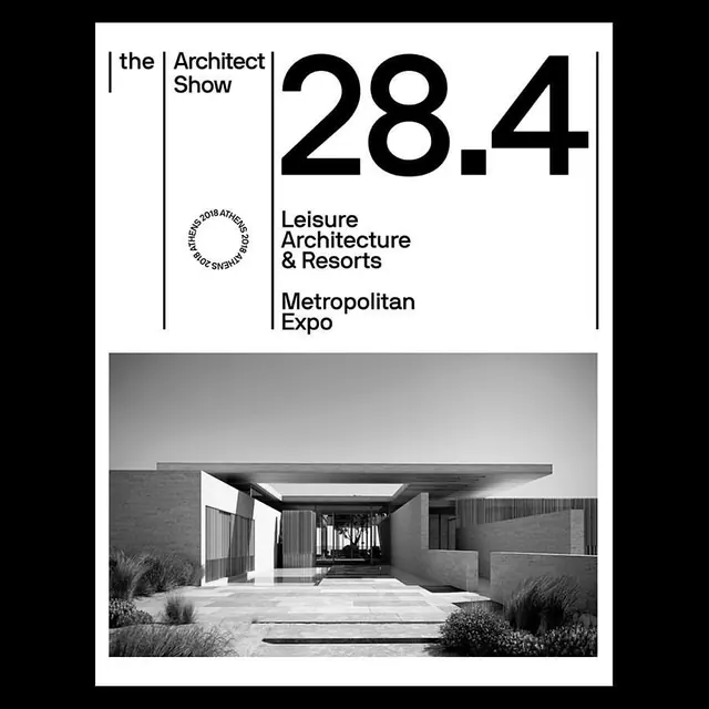
Design project cover or hero featuring dark blue tonal palette with text hierarchy demonstrating color harmony study.
Summary
A design study exploring tonal color harmony using multiple shades of deep navy and blue, demonstrating the visual weight and depth possible within a restricted monochromatic palette.
Visual description
Dark navy blue background dominates the composition with varying saturation levels creating visual depth. The title or project name appears in white sans-serif type, positioned prominently in the upper portion. Subtle text or tagline in lighter gray or muted blue sits below. The color palette shifts between deep midnight blue (#0c2b60), darker navy (#0a2658), and very dark navy-black (#04173f), creating distinct zones within the single-hue family. White type provides the only high contrast element, making it the focal point. The overall effect is sophisticated and moodily elegant.
Key takeaway
Monochromatic depth through saturation. A single color family is infinite when you control saturation, brightness, and tone. This project proves you can build visual hierarchy and interest without introducing new hues.
Reuse notes
Ideal reference for monochromatic or limited-palette design. Study how white text pops against the navy field. Good for dark-mode interfaces or luxury/premium branding. The restraint here is intentional—useful when a single brand color needs to carry the entire composition. Requires careful typography sizing since color contrast is off the table for text hierarchy.