Preview image. Unlock full-res
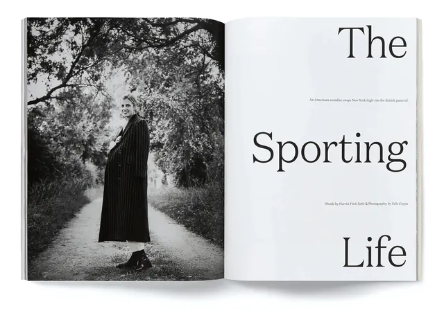
Left-page black-and-white portrait of a woman in vintage dress beneath tree canopy, paired with right-page title typography reading "The Sporting Life" in a serif typeface.
Summary
Editorial book spread design featuring a full-bleed black-and-white portrait photograph on the left paired with elegant serif typography reading "The Sporting Life" on the right.
Visual description
A two-page spread is shown as an open book. Left page: a full-bleed black-and-white photograph of a woman in a long pinstriped coat or dress, positioned beneath the canopy of a large tree. Her pose is contemplative, gazing to the side. The lighting emphasizes texture and creates a moody, vintage aesthetic. Right page: clean, minimal layout with the title "The" in large serif capitals at the top, followed by "Sporting" in the largest serif type, and "Life" below. Small gray body text appears above the word "The". The right page is predominantly white with generous white space, allowing the typography to breathe.
Key takeaway
Pairing a strong portrait with minimal typography creates editorial impact. The asymmetry (busy photo vs. clean type) creates visual tension and guides the eye. Serif type conveys sophistication and editorial authority.
Reuse notes
Excellent reference for editorial design, publishing, fashion brands, and luxury goods. The monochromatic approach works across print and digital contexts. The generous white space and restrained typography are particularly effective for high-end publications, magazines, and book design. The vintage quality suggests heritage and craftsmanship.
More like this

Keep what you find
A free account saves references to boards and can send you a weekly email of picks based on what you save.
To see every result, go Pro.