Preview image. Unlock full-res
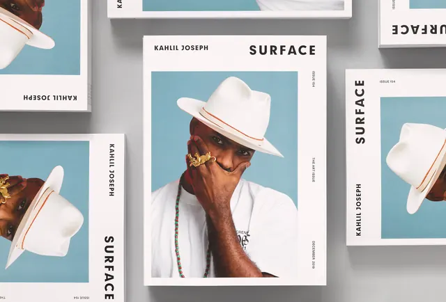
A multi-panel magazine layout featuring the word SURFACE with a portrait photograph and interior styling elements arranged in a grid.
Summary
A magazine spread showcasing the word SURFACE with photography and subtle interior design elements arranged in a structured grid layout with muted earth tones.
Visual description
The layout uses a grid of white cards against a blue-gray wall. Large display typography reads SURFACE with a portrait of a man in a white hat as the focal image, surrounded by additional photographs of styling details. The color palette is restrained with grays, taupes, and warm earth tones.
Key takeaway
The effective use of white cards as containers and framing devices in editorial layout, creating visual hierarchy through card grouping and scale variation. Typography placement anchors the composition.
Reuse notes
Strong reference for magazine design, editorial layouts, and product catalogs. The neutral palette and grid system work well for luxury, design, or lifestyle publications.
More like this



Keep what you find
A free account saves references to boards and can send you a weekly email of picks based on what you save.
To see every result, go Pro.