Preview image. Unlock full-res
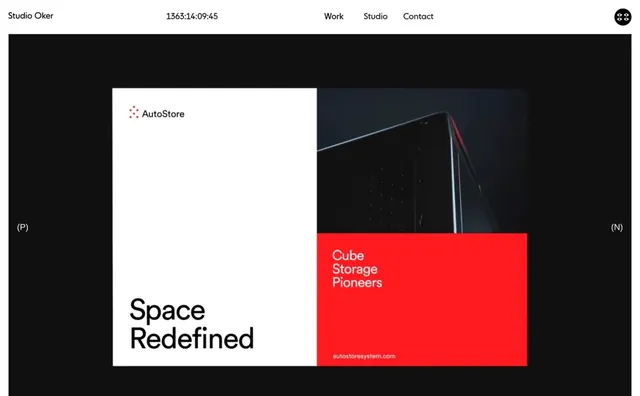
A digital portfolio or website layout showcasing a brand identity for AutoStore featuring a split-screen composition of typography and photography.
Summary
A digital portfolio or website layout showcasing a brand identity for AutoStore featuring a split-screen composition of typography and photography.
Visual description
The layout uses a heavy grid with a large white block on the left containing the 'AutoStore' logo and 'Space Redefined' text. The right side features a dark photograph of a geometric object paired with a vibrant red block containing the text 'Cube Storage Pioneers'.
Key takeaway
Use high-contrast color blocking and oversized sans-serif typography to create a strong visual hierarchy and a sense of scale.
Reuse notes
Apply this layout for product launches or brand identity presentations where a balance of technical imagery and bold messaging is required.
More like this



Keep what you find
A free account saves references to boards and can send you a weekly email of picks based on what you save.
To see every result, go Pro.