
Preview image. Unlock full-res
A 28-slide deep-tech investor pitch for WayRay holographic AR displays that pairs clean white text slides and a single crimson accent with full-bleed near-black slides of glowing 3D renders, exploded optical diagrams, and red-lit lab photography.
Summary
A 28-slide investor pitch for WayRay, a holographic augmented-reality display company targeting car windshields and built environments. Its personality comes from a strict two-register system: airy white slides carrying a single crimson accent for text and stats, alternating with full-bleed near-black slides built around glowing 3D product renders, exploded optical diagrams, and dramatic red-lit lab photography.
Visual description
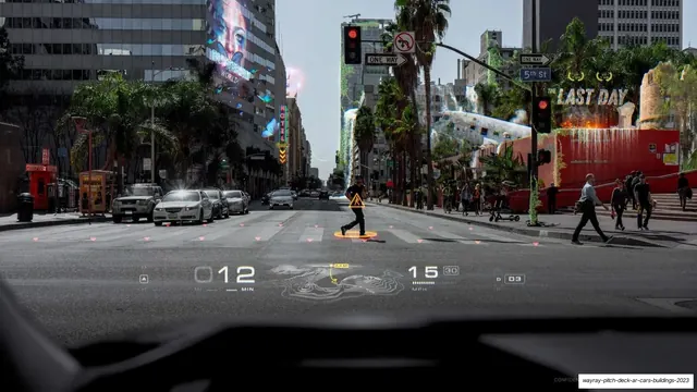
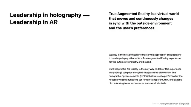
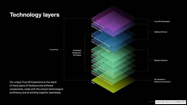
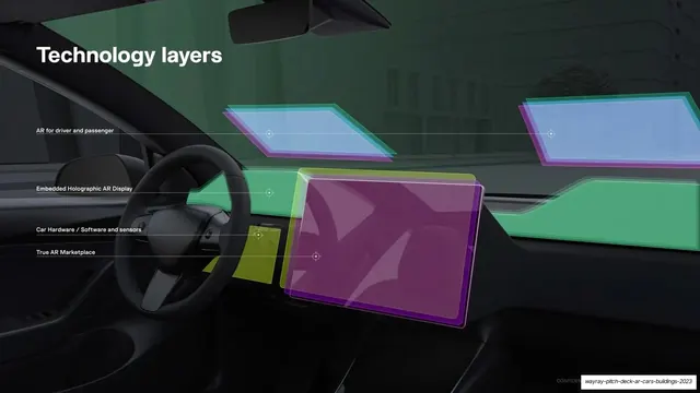
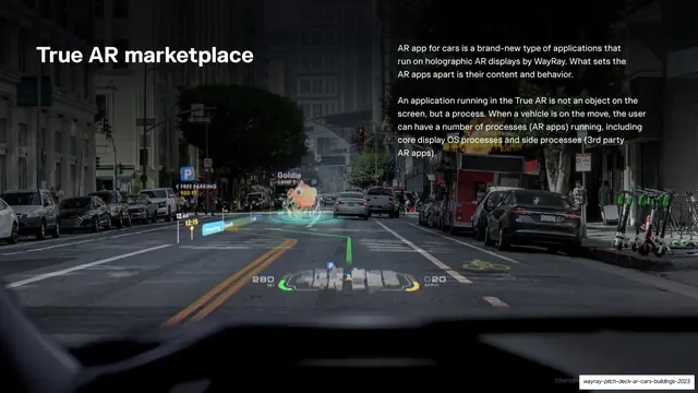
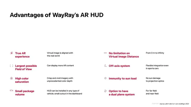
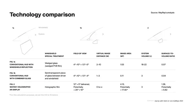
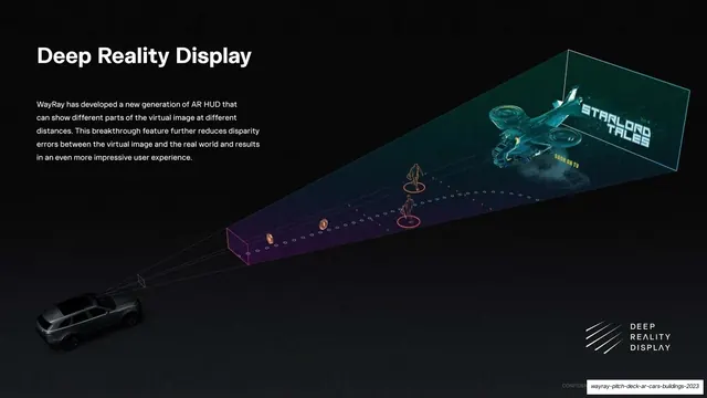
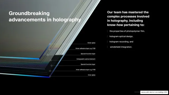
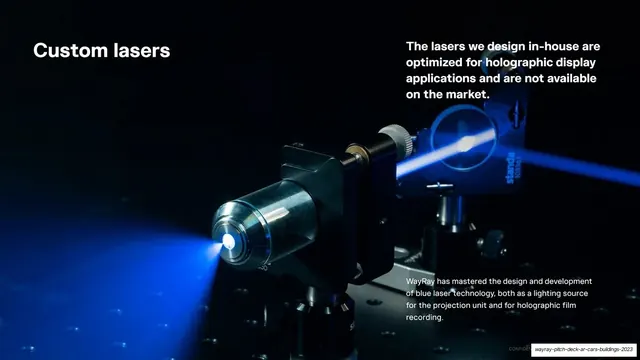
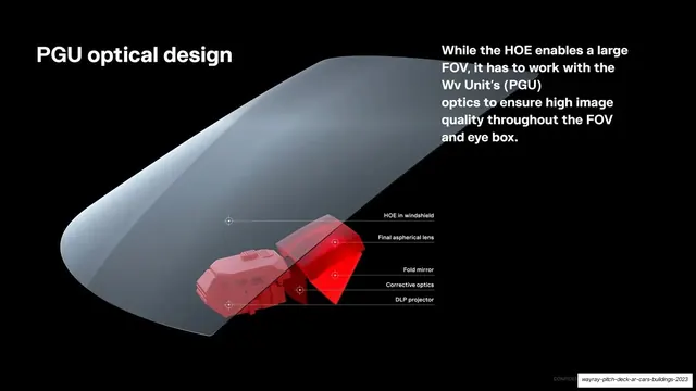
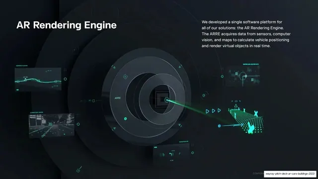
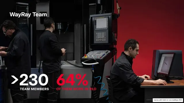
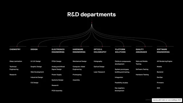
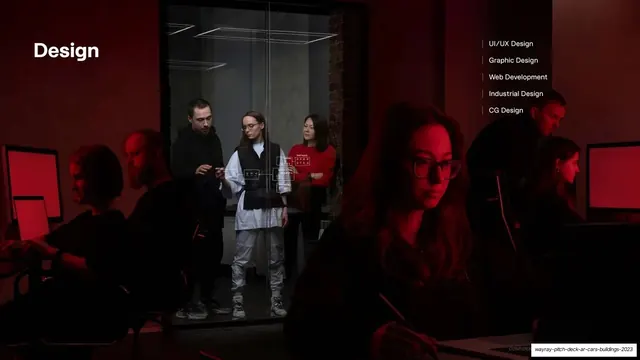
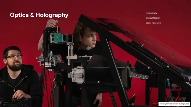
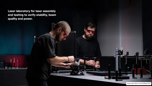
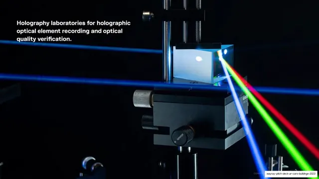
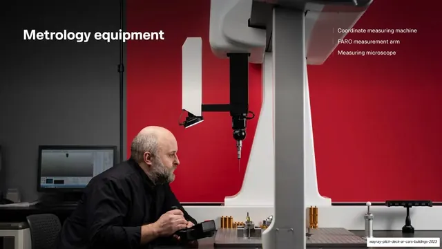
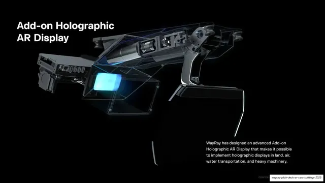
Slides run 16:9. Two background registers alternate through the deck. The light register is near-white with an oversized bold grotesque sans headline locked to the top-left, and either a large crimson (#E4002B) statement sentence or a multi-column body block set in black or red beneath it; the crimson is the only color and does all the emphasis work (mission statement, "primary revenue sources", red stat numbers like >230 and 64%). The dark register is a near-black (#0A0A0A) field where a white headline sits top-left and a white body paragraph sits top-right or beside it, with the lower two-thirds given to a high-end visual: layered translucent green-to-magenta technology stacks, exploded windshield and PGU optical diagrams with thin leader lines and crosshair markers, blue-laser and rainbow-laser lab close-ups, and product renders glowing cyan. Full-bleed photographic slides carry AR head-up-display mockups composited over real city and street scenes (navigation arrows, speed and distance readouts, floating AR game pieces) and studio team photography shot against a saturated red or black backdrop. Recurring devices: a two-column "advantages" grid with tiny red line icons and label-plus-detail pairs; a thin-rule data comparison table; a centered fan diagram branching "R&D departments" into eight columns; right-aligned vertical hairline-bulleted capability lists on the photo slides. A small grey "CONFIDENTIAL" marker sits bottom-right on most slides.
Key takeaway
The discipline of one accent color: a single crimson carries every emphasis across an otherwise black-and-white deck, so the eye always knows where the point is. The hard alternation between bright minimal text slides and dark cinematic render slides paces a long technical story and keeps dense engineering content from feeling monotonous. And the exploded-diagram grammar (translucent stacked layers, thin leader lines, crosshair anchor dots) is a reusable way to make complex hardware legible and premium.
Reuse notes
A strong reference for deep-tech, hardware, automotive, and R&D-heavy pitch or product decks that must explain complicated engineering to investors. The light-text / dark-render alternation works for any company whose proof points are equal parts narrative and visualization. It leans hard on genuinely high-end assets: photoreal 3D renders, exploded CAD diagrams, and controlled studio and lab photography. Without that production quality the dark slides collapse; the white text slides are easy to reproduce, the dark visual slides are not.
From this deck: WayRay Pitch Deck 2023
View deck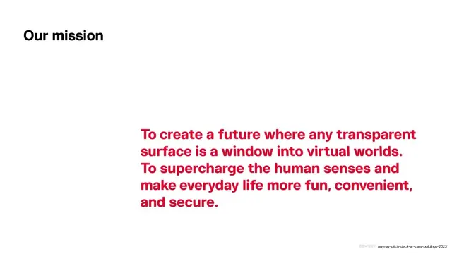



More like this









Keep what you find
A free account saves references to boards and can send you a weekly email of picks based on what you save.
To see every result, go Pro.