Preview image. Unlock full-res
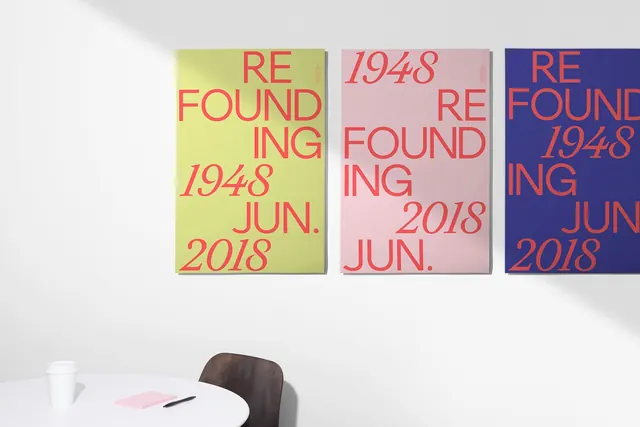
Typographic poster series with three color-blocked panels displaying "REFOUNDING 1948" and "2018" text in contrasting hues—a visual identity system for a brand repositioning.
Summary
A three-panel typographic identity system for the Ogilvy brand refounding, each panel rendered in distinct pastel color combinations featuring "REFOUNDING 1948" and "2018" in bold sans-serif all-caps.
Visual description
Three rectangular panels arranged horizontally, each filled with a different pastel color: yellow-green, blush pink, and deep purple. Each panel displays the same typographic composition in contrasting sans-serif capitals: "REFOUNDING" and "1948" stacked above "2018." The text in each panel is rendered in a complementary color creating high legibility through contrast. The geometric simplicity and repetition across the three panels establish a cohesive, modular identity system.
Key takeaway
A simple typographic module repeated across a limited color palette creates a strong, recognizable identity system—each variation is distinct yet unmistakably part of the same family.
Reuse notes
Perfect reference for corporate rebrand campaigns, identity system development, or poster series design. The restrained color palette and sans-serif typography work well for B2B companies, professional services, or institutions marking a significant milestone or transition.