Preview image. Unlock full-res
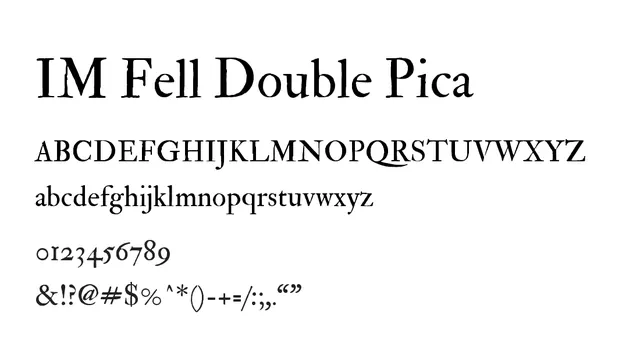
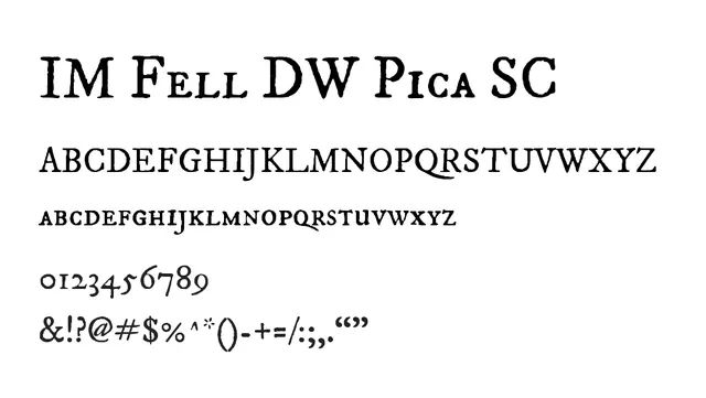
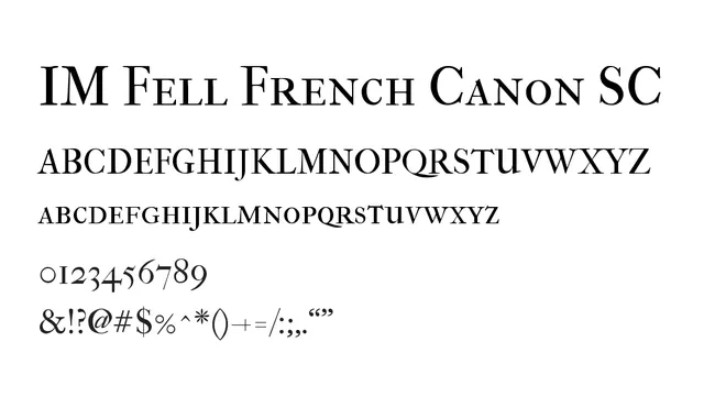
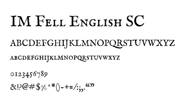
An elegant 18th-century transitional serif with small caps, embodying the English variant's refined letterforms and classical proportions.
Styleelegant, traditional, formal, high-contrast
Typeserif, transitional
Moodsophisticated, classical, refined, timeless
Summary
An elegant 18th-century transitional serif with small caps, embodying the English variant's refined letterforms and classical proportions.
What to use it for
Perfect for literary and editorial applications, heritage branding, and formal publications. The English variant maintains authentic historical character while the small caps option provides refined alternatives for traditional text treatment and emphasis.
Pairing
Pairs beautifully with Baskerville for period-authentic designs or with clean neo-grotesques like Univers for elegant historical-modern blends.