Preview image. Unlock full-res
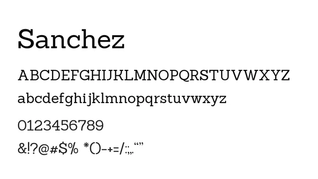
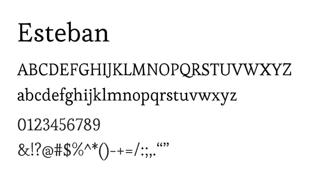
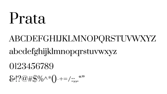
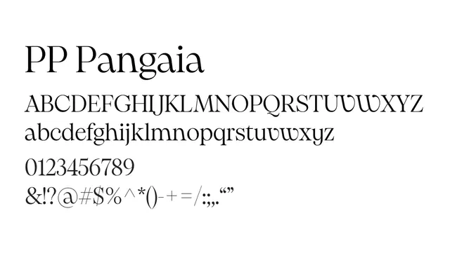
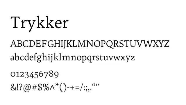
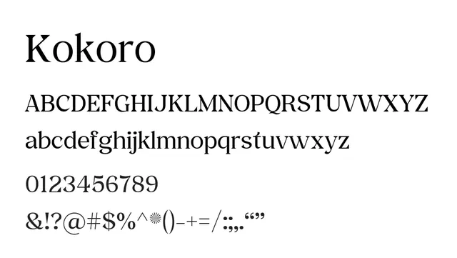
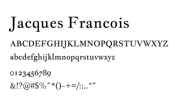
A refined classical slab-serif with elegant proportions and friendly character, balancing tradition with subtle modernity.
Summary
A refined classical slab-serif with elegant proportions and friendly character, balancing tradition with subtle modernity.
What to use it for
Best used for editorial headlines, luxury branding, and book covers where classical refinement is valued. The regular weight and moderate contrast provide good readability for display use. Less suitable for extended body text, but excellent for display paragraphs and prominent feature text in publications.
Pairing
Works beautifully with humanist sans-serifs like Source Sans Pro or geometric sans-serifs like Avenir to create sophisticated editorial layouts combining classical warmth with clean contemporary clarity.