Preview image. Unlock full-res
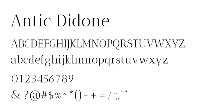
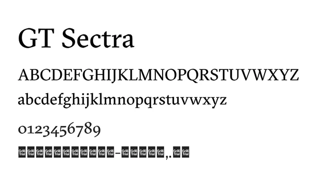
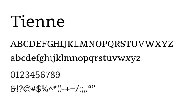
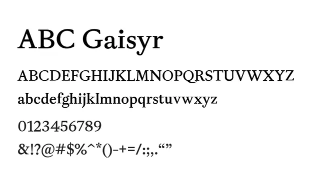
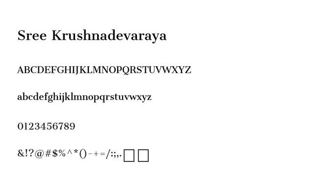
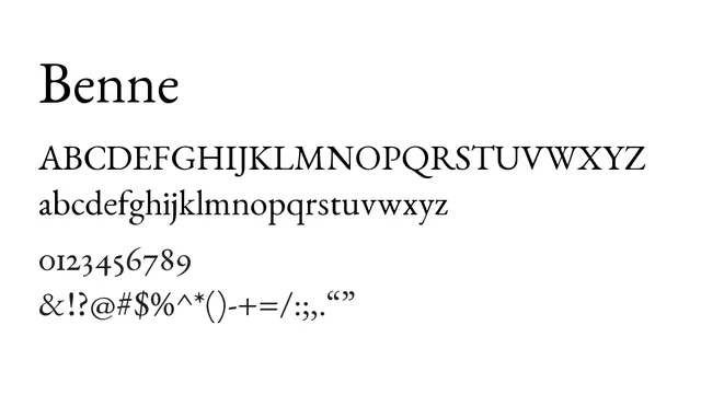
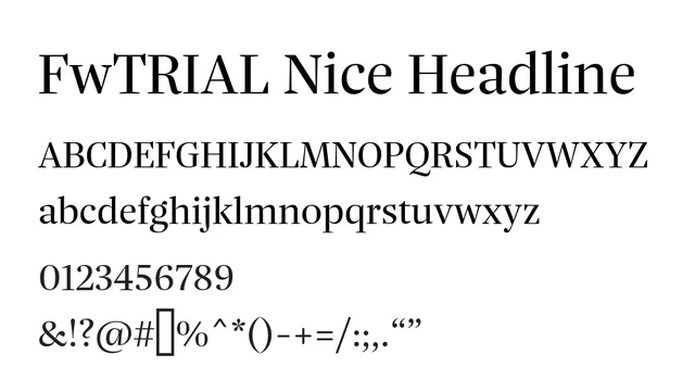
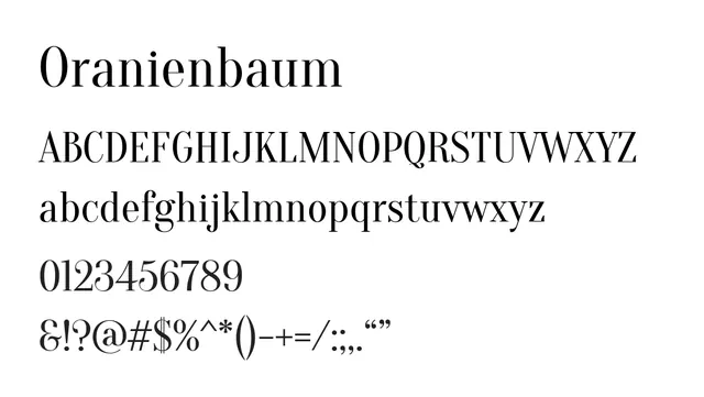
A classical high-contrast serif with pronounced thick-thin variation in the Didone style, conveying editorial elegance and formal sophistication.
Styleformal, elegant, high-contrast, classical
Moodauthoritative, refined, editorial, timeless
Industryluxury, editorial, fashion, publishing, branding
Summary
A classical high-contrast serif with pronounced thick-thin variation in the Didone style, conveying editorial elegance and formal sophistication.
What to use it for
Excellent for headlines and large body text in editorial and luxury contexts. Its high contrast and elegant proportions work well for magazine headers, book titles, and upscale branding. Can work for body copy at generous sizes but may strain at very small sizes.
Pairing
Pairs effectively with clean sans-serifs like Inter or Proxima Nova for supporting text and UI elements.