Preview image. Unlock full-res
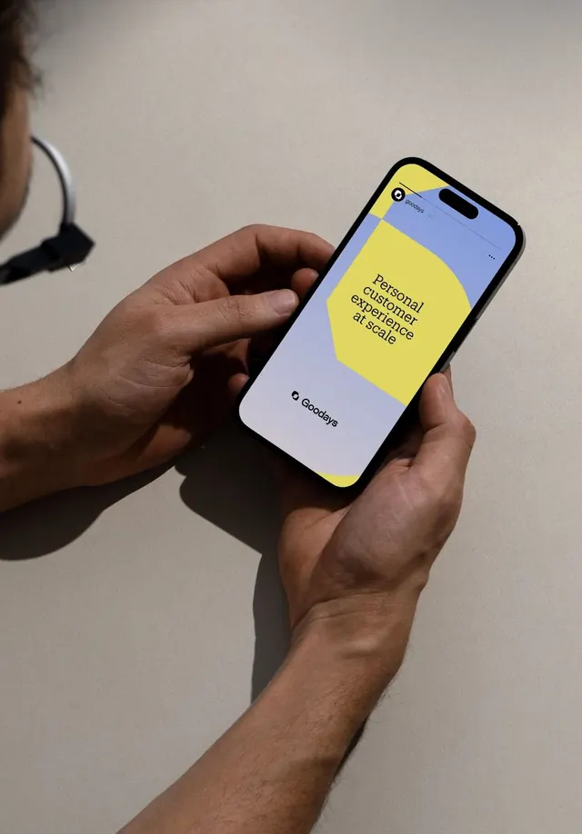
Hands-on product photograph of a mobile app interface showing the Goodays app with bold yellow and periwinkle color blocking.
Summary
Hands holding a smartphone displaying the Goodays app interface split between a bright yellow text area and a soft periwinkle background.
Visual description
A close-up product photograph of a smartphone held vertically in two hands against a neutral beige wall. The notched iPhone screen displays the Goodays app UI in two main zones: the upper half is bright golden yellow containing centered black sans-serif text reading "Personal customer experience at scale" with generous white space; the lower half is a soft periwinkle blue containing the centered "Goodays" wordmark in small black type. The color separation creates strong visual hierarchy, with yellow commanding attention for the headline and periwinkle anchoring the brand below. The hands are skin-toned and relaxed against the wall, with soft shadows adding dimension to the product shot.
Key takeaway
Bold color blocking makes a simple message unmistakable: one bright color carries the primary value proposition, while a complementary secondary color grounds the brand identity. The geometric split is clean and modern, with no visual clutter competing for attention. The hands-on perspective humanizes the interface and suggests real-world usage.
Reuse notes
Strong for consumer app marketing and case studies. The color blocking approach works for any app that needs to separate primary messaging from brand identity. The mockup photography is versatile for social media, landing pages, or presentation decks.
More like this

Keep what you find
A free account saves references to boards and can send you a weekly email of picks based on what you save.
To see every result, go Pro.