Preview image. Unlock full-res
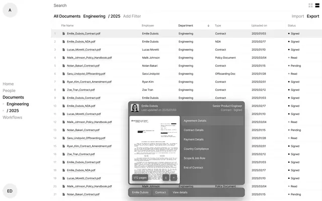
A data-dense document-management interface featuring a multi-column table of contracts and onboarding documents, with a hover-triggered detail panel showing file preview and metadata.
Summary
An HR or legal-tech interface for browsing and managing employee contracts and documents, featuring a sortable data table with an overlaid detail panel that appears on hover or click.
Visual description
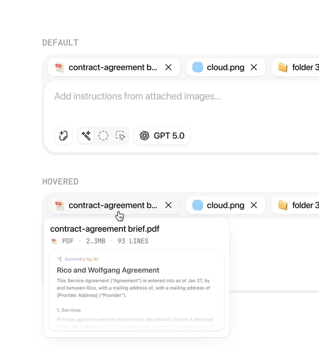
The screen is split into a table on the left and a modal detail panel on the right. The table lists documents by File Name (e.g., "Emilie_Dubois_Contract.pdf"), Employee, Department (Engineering), Type (Contract, NDA, Policy Document, Offboarding Doc), Uploaded date, and Status (Signed, Read, Pending), with rows numbered 1-21 visible. A left sidebar offers navigation (Home, People, Documents, Engineering / 2025, Workflows). The detail panel, triggered by hovering over a row (here Emilie Dubois), shows a PDF preview thumbnail on the left and metadata on the right: employee name, title (Senior Product Engineer), last updated date, and sections like Agreement Details, Contract Details, Payment Details, Country Compliance, Scope and Job Role, End of Contract. All elements use a neutral palette of white, light grays, and dark gray text with occasional accent colors (green for "Signed" status, muted blue for headers).
Key takeaway
The two-pane approach (table + detail panel) is a proven pattern for dense data. The preview thumbnail in the panel gives context without loading a full page. The Status column uses color sparingly (green dot for signed, orange for pending) to create quick scannability. The structured metadata sections in the detail panel make complex information digestible without overwhelming the main table view.
Reuse notes
Essential for any HR, legal, document-management, or compliance-heavy product. Works equally for contract repositories, personnel files, procurement, or procurement workflows. The neutral color palette keeps focus on the data; this is not a place for branding. Consider this pattern when you need to let users browse many items and inspect details without navigation overhead. The modal-on-hover interaction is smooth for desktop but may need rework for mobile (consider a separate detail page or a slide-out panel).
More like this

Keep what you find
A free account saves references to boards and can send you a weekly email of picks based on what you save.
To see every result, go Pro.