Preview image. Unlock full-res
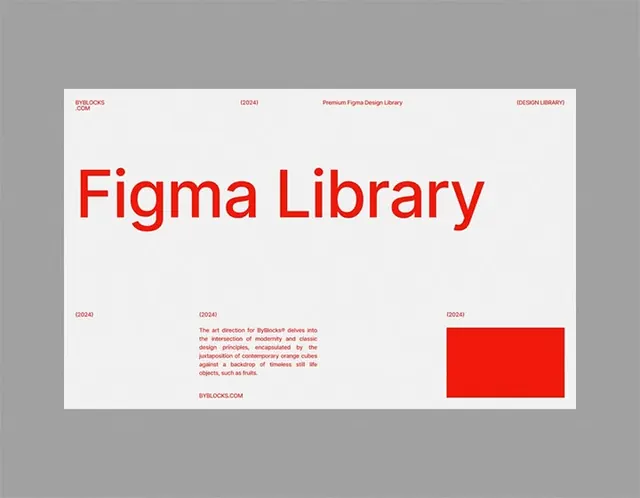
A design system presentation cover with bold red title typography, structured metadata grid, descriptive body copy, and accent rectangle on white background.
Summary
A design system cover page for Figma Library, featuring a monumental red title, structured metadata labels, gray body paragraph, and solid red accent rectangle on white.
Visual description
The layout is symmetrically organized on a white background with generous margins. A large red sans-serif title "Figma Library" dominates the upper half in bold, condensed capitals. Across the top edge sit small metadata labels in red type: byblocks.com, D2024, Premium Figma Design Library, and DESIGN LIBRARY. Below the title sits a gray paragraph of body copy describing the design system's purpose and aesthetic. On the lower right, a solid red rectangle serves as a bold graphic element. The lower left corner contains additional metadata labels (D2024) aligned left. The typography is strict sans-serif, leveraging white space and color contrast to communicate authority and precision.
Key takeaway
The power of a single accent color (red) deployed sparingly but loudly to break a neutral palette and direct attention. The structured approach to metadata labels creating a professional framework without clutter. The pairing of enormous display type with modest body text and white space to ensure hierarchy and legibility.
Reuse notes
Excellent template for design system covers, software tool documentation, or developer-facing product presentations. The red-on-white contrast is particularly effective for technical design libraries, SaaS onboarding, or developer-tool branding where precision and clarity are paramount.
More like this


Keep what you find
A free account saves references to boards and can send you a weekly email of picks based on what you save.
To see every result, go Pro.