Preview image. Unlock full-res
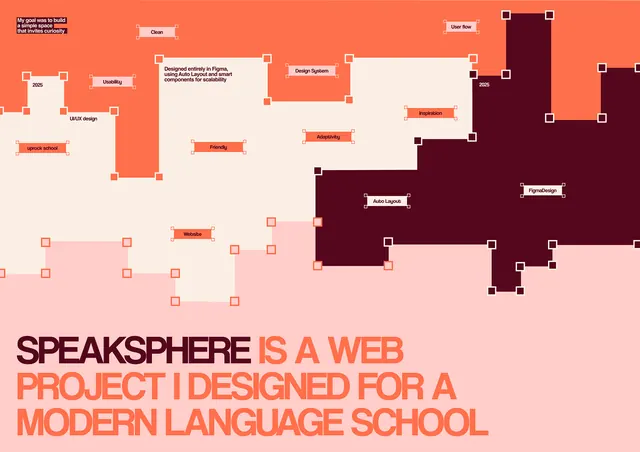
A diagrammatic flowchart with nested rectangular blocks in coral-orange and deep maroon arranged asymmetrically over a gradient pink background, labeled with system components and hierarchies.
Summary
A system diagram with nested coral-orange and deep maroon rectangular blocks arranged asymmetrically on a gradient pink background, labeled with component names and hierarchical relationships.
Visual description
The upper two-thirds of the image contains a complex flowchart with roughly 20 rectangular blocks in two main colors: bright coral-orange (upper-left cluster) and deep maroon (upper-right and center clusters). Blocks vary in size and are arranged in an organic, non-grid pattern. Small selection handles appear at block corners (white squares), suggesting an active design tool state. Text labels in dark sans-serif sit inside and adjacent to blocks (e.g., "Design System", "Figma", "Friendly", "Interaction", "Accessibility"). The lower third shows a pale-pink area below the blocks. At the bottom in bold coral-orange sans-serif headline: "SPEAKSPHERE IS A WEB PROJECT I DESIGNED FOR A MODERN LANGUAGE SCHOOL". The overall composition reads as an architectural diagram or educational flowchart showing interconnected system components.
Key takeaway
The asymmetric block arrangement that avoids rigid grid layout while maintaining visual clarity through size and color differentiation. The use of warm-toned dual-color palette (coral and maroon) for primary contrast. The minimal styling (flat fills, no shadows) that keeps focus on information hierarchy and relationships.
Reuse notes
Excellent for presenting software architecture, design system components, or educational frameworks. Works in academic contexts, design education materials, and software development documentation. The warm palette and professional block treatment suit both formal presentations and creative case studies. Maintain sufficient white space around block clusters for readability.
More like this



Keep what you find
A free account saves references to boards and can send you a weekly email of picks based on what you save.
To see every result, go Pro.