Preview image. Unlock full-res
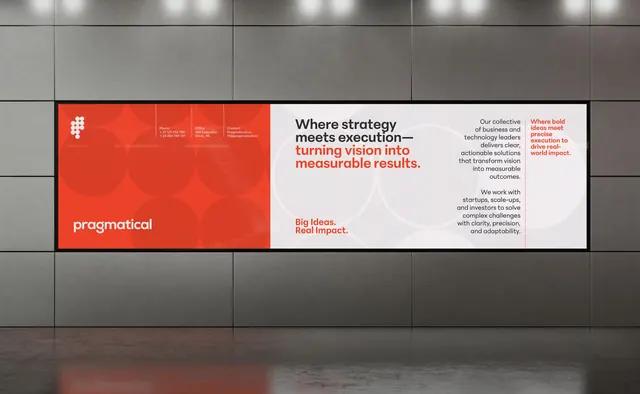
Split-screen billboard with bold red company block and light gray value-prop section, visual identity for B2B consulting firm.
Summary
Pragmatical consulting billboard dividing visual identity into a bold hot-red company block on the left and light gray multi-column narrative on the right.
Visual description
A horizontal billboard divided by a vertical black frame line. The left half is solid burnt-orange-red with a large white plus-sign logo and company name "pragmatical" in clean white sans-serif lowercase. Small white text lists phone, office location, and contact email in a subtle informational grid. The right half uses off-white and light gray backgrounds with dark charcoal headlines and body copy. The top section states the core message: "Where strategy meets execution turning vision into measurable results" with key phrases like "turning vision into measurable results" in the same warm red. Below is the brand tagline "Big Ideas. Real Impact." A third section describes the firm's approach in gray body copy. The entire design sits within a steel-gray industrial backdrop, emphasizing the billboard's scale and public setting.
Key takeaway
Stark left/right color blocking creates immediate hierarchy and visual interest on a large format. Confining narrative text to one side lets the bold color block act as a breathing visual anchor. Red plus-sign logo on red becomes an identity mark that only reveals on close inspection. Mixing warm (red) and cool (gray) undertones prevents the palette from feeling flat.
Reuse notes
Perfect for B2B consulting, professional services, and corporate brand campaigns. Works at billboard and poster scale where the color blocking reads from a distance. The restraint (just one color accent, one simple logo) elevates the design. Use white text on the bold color block only if contrast is guaranteed; this example's light color choice would fail on many backgrounds.
More like this




Keep what you find
A free account saves references to boards and can send you a weekly email of picks based on what you save.
To see every result, go Pro.