Preview image. Unlock full-res
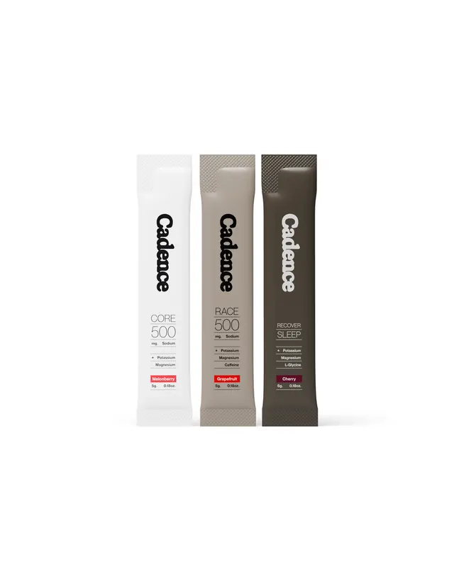
Three vertical supplement tubes in white, tan, and dark brown with minimalist sans-serif branding and functional product hierarchy.
Summary
Three tall, slender pharmaceutical tubes in white, warm tan, and dark brown, each labeled "Cadence" with product descriptors (CORE, PACE, REPAIR) and ingredient lists in sans-serif type on light ground.
Visual description
Three vertical plastic/tube containers arranged side by side against a light background. Each tube is tall and narrow, approximately 8-10 inches high. Left tube is white with black text reading "Cadence" and "CORE 500". Middle tube is warm taupe/tan with black text reading "Cadence" and "PACE 500". Right tube is dark brown/charcoal with white text reading "Cadence" and "REPAIR SLEEP". Each container has smaller body text below the product name (ingredient lists or descriptors) and a small red accent bar near the bottom. Typography is clean, contemporary sans-serif in a narrow/condensed weight. The color progression suggests product differentiation (wellness stages or supplement types).
Key takeaway
A cohesive three-SKU system using only black, white, and brown creates perceived sophistication without relying on color. The narrow vertical format and centered layout feels premium and organized. Repeating the brand mark and consistent type treatment across variants creates family unity. The small red accent provides a subtle call-out without breaking the restrained palette.
Reuse notes
Highly effective for supplements, wellness products, and pharmaceuticals where clinical trust and modern minimalism matter more than vibrant branding. The monochromatic approach works in small print and at distance. Pair this with educational packaging (back panel dense with ingredient/dosage info). Avoid if your category competes on visual novelty; this wins on clarity and calm.
More like this



![[Be] Life. brand wordmark, minimal, swiss, dark](https://images.vasa.works/_t/graphics/ae6d55b3e71b64d50aa463d6e9390702.webp)


Keep what you find
A free account saves references to boards and can send you a weekly email of picks based on what you save.
To see every result, go Pro.