Preview image. Unlock full-res
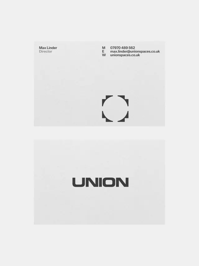
Two-part corporate identity specimen showing a minimalist geometric logo and contact card in monochromatic black and gray.
Summary
A Swiss-style identity system pairing a geometric logo made from corner brackets around a hollow circle with a restrained business card showing name, title, and contact details in left-aligned hierarchy.
Visual description
Upper section displays a minimal logo centered on a light gray background: four corner brackets (right angles) positioned at cardinal points around an open circle, forming a frame-like mark in heavy black. Lower section shows a horizontal business card layout on white ground with contact info left-aligned in three columns: "M E W" (abbreviations for phone, email, website) with corresponding details for Max Linder, Director at Union Spaces. All type is sans-serif, regular weight, with generous spacing. High contrast between black text and white/light backgrounds. No color, no decoration beyond the structural logo mark.
Key takeaway
The corner-bracket logo technique: simple geometric shapes that suggest framing or containment without requiring a complex symbol. The card's columnar label system (M/E/W) compresses contact info while maintaining scanability. Extreme restraint with whitespace creates institutional, trustworthy presence.
Reuse notes
Strong for architecture, real-estate, corporate, or B2B firms that want serious, understated identity. The corner-bracket logo scales well across sizes and media. Works best when paired with generous margins and quality paper stocks to justify the minimalism.
More like this



Keep what you find
A free account saves references to boards and can send you a weekly email of picks based on what you save.
To see every result, go Pro.