Preview image. Unlock full-res
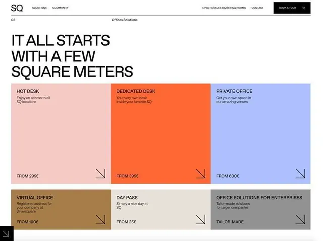
A six-card pricing grid for office rentals using bold color blocking across pink, orange, blue, tan, and grey to differentiate service tiers.
Summary
A six-card pricing grid using bold color blocking to differentiate office-rental tiers, each labeled with service type and monthly price.
Visual description
Six rectangular cards arranged in a 3x2 grid, each filled with a distinct flat color: soft pink (hot desk), bright coral (dedicated desk), periwinkle blue (private office), muted olive (virtual office), warm grey (day pass), and slate grey (enterprise solutions). Each card contains left-aligned black sans-serif text with the service name, a brief description, and a price starting point (from 25 euros to "tailor-made"). A small arrow icon in the bottom-right corner of each card signals interactivity. The background is white, and the palette relies on saturated, complementary hues to create visual hierarchy and segment options clearly.
Key takeaway
The color-blocking strategy assigns each option a distinct, memorable hue, making it instantly scannable. The consistent card structure and minimal text (name, benefit, price) creates clarity without cognitive overload. The subtle corner arrows add navigational cue without complexity.
Reuse notes
Works for any tiered pricing or service menu where differentiation by color aids comprehension. The light background keeps the cards from feeling overwhelming. Use when visual segmentation matters more than detailed explanation.
More like this




Keep what you find
A free account saves references to boards and can send you a weekly email of picks based on what you save.
To see every result, go Pro.