Preview image. Unlock full-res
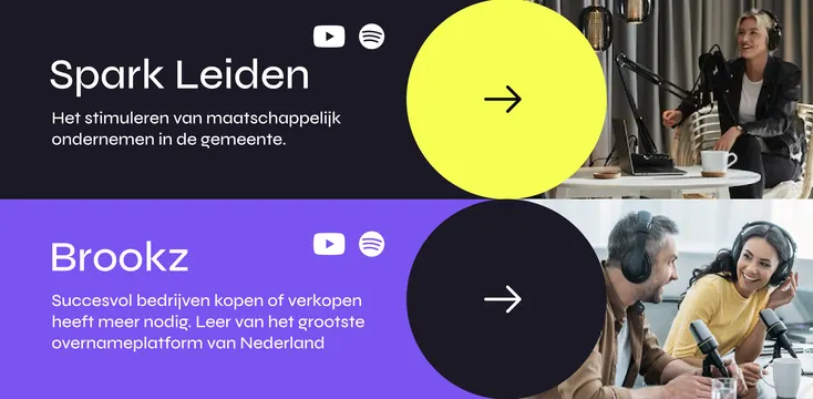
Two-column hero layout presenting dual service offerings (Spark Leiden on yellow, Brookz on purple) with overlapping circular call-to-action elements and paired photography.
Summary
Platform hero presenting two service offerings side by side: Spark Leiden (yellow section, left) and Brookz (purple section, right), each with a headline, Dutch supporting text, streaming/social icons, a large circular call-to-action button, and a paired photograph of people at work.
Visual description
Horizontally divided hero section with two distinct color zones. Left half: bright neon yellow background, white sans-serif headline "Spark Leiden" aligned top-left, grey body copy (Dutch) below, YouTube and Spotify icons (white), and a large yellow circle with a white arrow floating right. Right half: deep purple-to-dark background, white headline "Brookz", grey copy below, same social icons (white), and a large black circle with white arrow. Above each section sits a photograph (people at desks, conversational, well-lit). The circles overlap slightly across the center dividing line, creating visual continuity and suggesting progression. Typography is clean, sans-serif, with restrained use of white and light grey.
Key takeaway
The split-column hero treats each service as equal weight yet visually distinct through opposing colors (yellow vs. purple—a natural complementary pair). The floating circular CTAs with arrows provide directional momentum and intrigue without being aggressive. Using the exact same icon set and proportions on both sides creates rhythm and predictability. The photography (real people working) humanizes B2B offerings and breaks the graphic severity.
Reuse notes
Excellent template for platforms or agencies offering multiple complementary services or target segments. The yellow/purple pairing is bold and works particularly well for Dutch or Northern European design sensibilities; adapt the colors to your brand's complementary pair if needed. The circular-button pattern is memorable and works well on dark backgrounds. Best deployed on desktop; mobile may require stacking rather than side-by-side. Avoid if targeting audiences who find neon colors jarring; the boldness is intentional but not universal.
More like this



Keep what you find
A free account saves references to boards and can send you a weekly email of picks based on what you save.
To see every result, go Pro.