Preview image. Unlock full-res
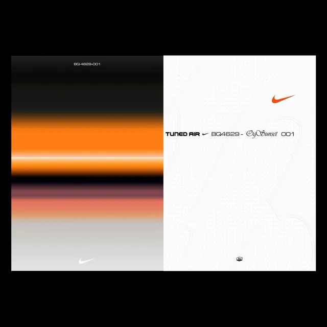
Landscape product graphic split down the center: left half is a blurred atmospheric sunset gradient (black to orange to pink to grey), right half is a clean white panel with Nike swoosh and mixed-typography product label for Tuned Air BQ4629 OgSunset 001.
Summary
Split-panel landscape graphic with an atmospheric blurred sunset gradient on the left and a stark white product-label panel on the right, pairing abstract color photography with mixed serif, script, and sans-serif Nike product typography.
Visual description
The composition is precisely halved vertically. The left panel contains an out-of-focus horizontal gradient that reads as a stylized sunset: dense black at the top fades into a wide band of saturated orange with a thin white horizon line, then drops into muted rose-pink, salmon, and finally pale grey at the bottom. A small white Nike swoosh sits bottom-center of this panel, nearly dissolved into the gradient. The right panel is pure white with a faint large-scale topographic or shoe-sole line art as a ghost pattern. In the upper right, a solid orange Nike swoosh marks the brand. Centered at mid-panel, the product label reads "TUNED AIR" in condensed bold all-caps sans-serif, a slash and swoosh separator, then "BQ4629 -" in the same weight, followed by "OgSunset" in a flowing italic script serif, and "001" in sans. A small SKU code "BQ 4629-001" in small sans-serif sits top-left of the left panel. At the very bottom of the right panel, a small circular emblem appears.
Key takeaway
Using a blurred abstract photograph as pure color rather than as a representational image. The hard vertical split lets two completely different visual languages (warm gradient photography vs. cold white editorial) share one rectangle without competing. The mixed-typography product label stacking condensed sans, script, and numerics codes product in a way that feels both archival and contemporary.
Reuse notes
Ideal reference for sneaker or premium fashion product drops where the colorway name needs to be communicated as a mood before the product itself is shown. The split-panel technique translates to any campaign where you have a strong brand color story. The ghost topographic line art on the white panel is subtle enough to add texture without distracting from the type; use it only on light backgrounds.
More like this

Keep what you find
A free account saves references to boards and can send you a weekly email of picks based on what you save.
To see every result, go Pro.