Preview image. Unlock full-res
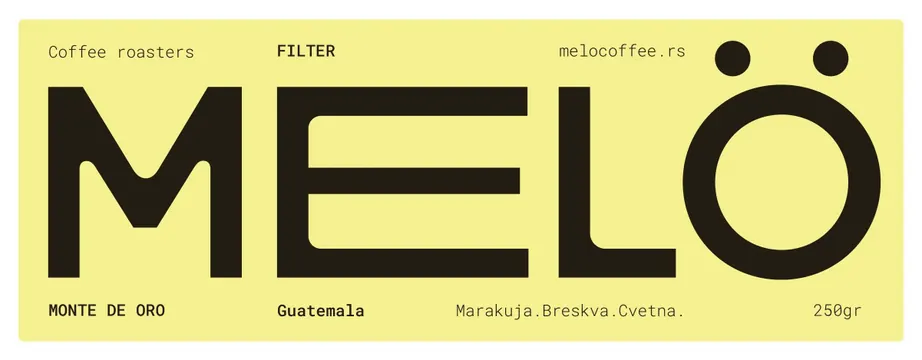
Bright yellow coffee label featuring a single massive black letterform filling the composition, with hierarchical text for origin, terroir, and weight.
Summary
Bright yellow coffee label for Melo's Monte de Oro Guatemala single origin, with a single massive black letterform dominating the entire composition and small text giving terroir and weight.
Visual description
Horizontal rectangular label with a vibrant yellow background. The left side shows small text: "Coffee roasters" in light weight sans-serif. Centered and dominating is an oversized black sans-serif letterform - clearly the primary brand mark - with two smaller circular shapes at its top-right corner, possibly representing decorative elements or brewing equipment. The middle reads "FILTER" in bold capitals. Right side contains "melocoffee.rs" (the web domain) at top, and at bottom the label states product specifics: "MONTE DE ORO", "Guatemala", "Marakuja.Breskva.Cvetna." (likely tasting notes), and "250gr" for weight. The entire design sits on unbroken yellow, creating high contrast with the black marks. Typography is exclusively sans-serif.
Key takeaway
The use of a single, vastly oversized letterform as a complete brand identity without needing an icon or symbol. The restraint of using only black and yellow, creating visual punch without chromatic noise. The small geometric circles as minimal decorative counterweight to the massive type.
Reuse notes
Strong for beverage, food, or tech brands wanting to convey craftsmanship via a single, confident typographic mark. Works especially well when the primary mark is a distinctive letter or word. Yellow backgrounds demand very dark text for accessibility; this handles contrast decisively.
More like this




Keep what you find
A free account saves references to boards and can send you a weekly email of picks based on what you save.
To see every result, go Pro.