Preview image. Unlock full-res
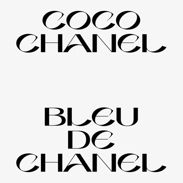
Minimalist typographic composition displaying "COCO CHANEL" and "BLEU DE CHANEL" in elegant serif letterforms on a light background.
Summary
A sophisticated typographic study displaying luxury brand and fragrance names in elegant serif letterforms arranged vertically on a neutral background.
Visual description
Two lines of text centered on a soft grey-white background. The top reads "COCO CHANEL" in a stylized serif typeface with elegant letterforms and inconsistent baseline creating visual sophistication. Below, separated by white space, reads "BLEU DE CHANEL" in the same serif style. The letterforms show elegant thin and thick contrast characteristic of classical serif fonts, with decorative styling. All text is in black. The layout is rigorously centered and symmetrical, creating a formal, gallery-like presentation.
Key takeaway
The power of elegant typography alone to communicate luxury and sophistication, without imagery or ornament. The serif typeface choice and careful spacing convey premium branding. The minimal layout respects the typography rather than competing with it.
Reuse notes
Ideal for luxury brand identity work, fragrance marketing, or prestige product presentations. The elegant serif styling is appropriate for heritage and luxury contexts. Works well for print applications, packaging, or gallery installations. The neutral background allows the typography to be the sole focus. Best used when brand and product names themselves are valuable intellectual property worth featured display.
More like this

Keep what you find
A free account saves references to boards and can send you a weekly email of picks based on what you save.
To see every result, go Pro.