Preview image. Unlock full-res
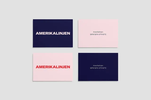
Modular card design system for "Amerikalinjen" featuring symmetrical layout with navy blue and soft pink cards, each displaying typographic treatment and coordinate information.
Summary
A minimalist branding or publication design system showing four card variations of "Amerikalinjen" arranged in a 2x2 grid, alternating between navy blue and soft pink backgrounds with white and red typography, plus coordinate information.
Visual description
Four rectangular cards are arranged in a symmetrical 2x2 grid on a light gray background. The top-left and bottom-right cards are navy blue; the top-right and bottom-left are soft pink. The navy cards display "AMERIKALINJEN" in clean white sans-serif typography. The pink cards display the same text in bold red sans-serif (lower left) or subtle gray text (top right). All cards include small coordinate text ("69.910°N 10.744°W" or similar) suggesting geographic information. The design demonstrates a modular, systematic approach to branding where consistent elements adapt to color and typography variations. The spacing and alignment are precise and geometric.
Key takeaway
A two-color system creates visual interest and distinction through inversion rather than additive complexity. Symmetrical arrangement of asymmetric elements creates rhythm. The systematic variation of typography and color demonstrates a scalable brand identity system. Simplicity and precision convey sophistication and professional credibility.
Reuse notes
Excellent reference for corporate identity systems, brand guidelines, or publication design. Strong for design consultancies, cultural institutions, or premium brands emphasizing systematic thinking. The dual-color approach is highly replicable and effective. Works well for business cards, publication covers, or promotional materials. The geometric grid layout is clean and professional. The coordinate text suggests a geographic or investigative narrative without being explicit. Ideal for contexts emphasizing design thinking, methodology, and systems. The monochromatic navy-pink palette is contemporary and premium. Avoid using when requiring warmth, complexity, or visual abundance.
More like this




Keep what you find
A free account saves references to boards and can send you a weekly email of picks based on what you save.
To see every result, go Pro.