Preview image. Unlock full-res
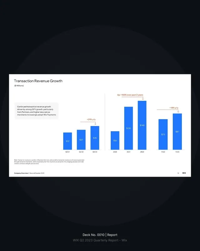
Financial bar chart with annotation callouts showing revenue growth rates and trend arrows over quarterly and annual periods.
Summary
Financial bar chart with annotation callouts showing revenue growth rates and trend arrows over quarterly and annual periods.
Visual description
White background with a clustered bar chart showing transaction revenue in millions across quarterly (Q2 21, Q2 22, Q2 23) and annual (2020-11/23) time periods. Bright blue bars are labeled with dollar values; annotation callouts in coral/rust highlight growth rates (+21% y/y, +165% over past 2 years, +18% y/y) with small downward arrows. Small body copy sits beneath the chart. The chart area is framed by light gray gridlines. Wix logo appears in the bottom-right corner with deck metadata footer.
Key takeaway
Using bright accent callouts (different color and arrow anchor) to highlight growth trends without cluttering the chart itself. Small directional arrows paired with growth labels for clarity. Combining multiple time-range views (quarterly and annual) to show both momentum and compound growth.
Reuse notes
Works for financial decks, investor updates, quarterly earnings reports, or SaaS product dashboards. The y-axis labeling in millions and gridlines keep the chart legible even at smaller scales. Color contrast (bright blue bars on light background) reads well in print and digital. Best for B2B or fintech contexts.
More like this



Keep what you find
A free account saves references to boards and can send you a weekly email of picks based on what you save.
To see every result, go Pro.