Preview image. Unlock full-res
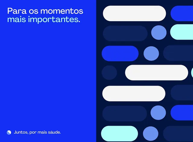
Split-screen composition pairing bright royal-blue text block with dark navy shape grid in contrasting hues.
Summary
A geometric component library laid out as a split screen: a bright royal-blue side with Portuguese copy faces a dark navy grid of rounded shapes in white, sky blue, and cyan.
Visual description
Left half: bright saturated royal blue background with two lines of white sans-serif text in Portuguese ("Para os momentos mais importantes" and "Juntos, por mais saúde") anchored with a small pie-chart accent icon. Right half: dark navy ground populated with a loose grid of rounded-corner pill shapes, circles, and partial-circle arcs in white, light blue, medium blue, and pale cyan. Elements are sized and positioned to suggest interactive states or a shape-based design system. No text or labels on the right; the color contrast and minimal geometry carry all visual weight.
Key takeaway
The confident split-screen proportions and the economy of a five-color palette doing all the work. The rounded, soft geometry on dark reads as friendly and modern without sacrifice. The absence of text on one side lets the shapes speak for themselves, useful for portfolio presentations or abstract system showcases.
Reuse notes
Strong for healthcare, insurance, or benefit-services landing pages that need to pair messaging with a modern aesthetic. The navy-light-blue-cyan triad is particular to wellness/trust messaging; adapt the hue for other verticals. Works at any scale because the shapes are pure CSS or SVG.
More like this
Keep what you find
A free account saves references to boards and can send you a weekly email of picks based on what you save.
To see every result, go Pro.