Preview image. Unlock full-res
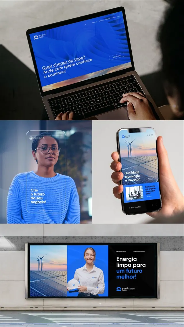
Multi-device energy brand campaign in Portuguese using blue gradients, bold orange accents, and photographic imagery of solar technology and people.
Summary
Energy brand system shown across laptop, mobile, and outdoor billboard, combining bright blue gradients with warm orange accents and real people, emphasizing renewable technology.
Visual description
Three scenes demonstrate the brand's digital and physical presence. Top: laptop displaying Portuguese headline text over an abstract blue linear gradient. Middle left: portrait of person in blue striped shirt in natural light with overlay text ("O futuro do seu negocio"). Middle right: phone mockup held in hand showing wind-farm landscape and service name. Bottom: large outdoor billboard with left side showing wind turbines and solar landscape, center section in saturated blue, right side featuring a smiling person in white shirt with right-aligned Portuguese text and logo. Throughout, sans-serif typography is clean and left or right aligned, consistent with the brand's structured minimalism.
Key takeaway
The gradient-to-solid color blocking (blue linear fading to blocks of saturated accent color) makes the blue feel energetic and directional. The consistent use of orange/warm accents against the cool blue creates visual pop on every surface. Real human faces paired with energy imagery (wind, solar) make renewable tech feel accessible and trustworthy.
Reuse notes
Strong template for B2B energy, sustainability, or climate-tech brands. The three-layer approach (digital, mobile, print) helps teams visualize system consistency. Works best when the orange accent is reserved for CTAs or key brand marks. Caution: requires high-quality portrait photography to match the premium aesthetic.
More like this


Keep what you find
A free account saves references to boards and can send you a weekly email of picks based on what you save.
To see every result, go Pro.