Preview image. Unlock full-res
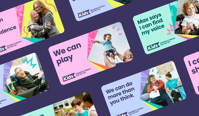
Grid of vibrant color-blocked cards featuring diverse children and inclusion messaging, with complementary pink, teal, yellow, and purple palette.
Summary
A grid of angled, color-blocked cards featuring diverse children and first-person statements like "We can play" and "Max says I can find my voice," promoting disability inclusion and social equity for a nonprofit.
Visual description
A dynamic collage layout set on a dark purple background, featuring roughly 8-10 rectangular cards arranged at varied angles and scaled sizes. Each card combines a bright solid color (hot pink, cyan, pale blue, mint, soft yellow) with a cropped photograph of a child on one side and sans-serif text on the other. The photography shows genuine candid moments; the typography is bold, all-lowercase or title-case, in a modern sans-serif weight. White accents and small illustrative icons (stars, lightning bolts) add playfulness. The card edges are crisp and clean, with no drop shadows, maintaining the flat design aesthetic. The overall composition feels kinetic and joyful.
Key takeaway
The angled card grid as a way to layer testimonials or concepts while maintaining visual energy. The pairing of photography with bold, solid color fields (avoiding white space). The restraint in the color palette (five colors maximum) despite its vibrant saturation. The use of scaled cards to guide the eye hierarchically.
Reuse notes
Ideal for nonprofit campaigns, social-impact messaging, or educational initiatives targeting inclusive audiences. The bright palette and playful typography feel youthful without being condescending. Works well for landing-page hero sections, campaign posters, or social media carousel content.
More like this

Keep what you find
A free account saves references to boards and can send you a weekly email of picks based on what you save.
To see every result, go Pro.