Preview image. Unlock full-res
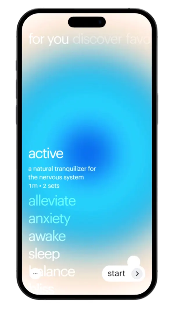
A mobile app interface with a radial blue gradient flowing from deeper cyan at the center to pale blush at the edges, layered over a dark phone frame with a list of benefit keywords and a start button.
Summary
A wellness app mockup featuring a centered phone frame filled with a radial blue-to-pink gradient, overlaid with a vertical list of benefit keywords (active, alleviate, anxiety, awake, sleep, balance) and a start button.
Visual description
A smartphone frame with a notch occupies the center on a soft neutral background. Inside the frame, a radial gradient radiates from deep cyan-blue (#20A9F2) in the middle outward to pale blush and off-white at the edges. Overlaid in medium weight sans-serif are the words "for you discover it" faintly at the top, then "active" in white followed by smaller descriptive text "a natural tranquilizer for the nervous system info 2 sets", below which six keywords stack vertically in pale blue and white: alleviate, anxiety, awake, sleep, balance. At the bottom right, a "start" label with an arrow icon serves as the primary action. The overall composition is calm, centered, and uses whitespace effectively.
Key takeaway
The radial gradient as a calming, depth-creating background that focuses attention inward. The stacked keyword list as a scannable benefits summary without full sentences. The balanced use of transparency and opacity in the type to create visual hierarchy in a minimal layout.
Reuse notes
Strong for wellness and healthcare product mockups. The gradient-over-centered-content pattern works well for meditation apps, mental-health tools, and wellness platforms. The soft color progression (cool-to-warm) telegraphs approachability and care.
More like this


Keep what you find
A free account saves references to boards and can send you a weekly email of picks based on what you save.
To see every result, go Pro.