Preview image. Unlock full-res
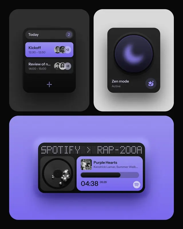
Three mobile app mockups combining dark interfaces with vibrant purple accents and skeuomorphic depth to showcase calendar scheduling, mindfulness mode, and music playback controls.
Summary
Mobile UI mockups stacking a dark event calendar, a zen-focus mode with a spinning gradient dial, and a music player with playback position, unified by purple accents and soft shadows.
Visual description
Three stacked UI mockups on a dark background. Left column: dark card labeled "Today" with two upcoming events (a purple "Kickoff" block with time 12:30-12:50 and attendee avatars, and a darker "Review of n..." entry). Right column: light gray card showing "Zen mode" with a large dark spherical dial exhibiting a subtle purple glow and swirl, suggesting motion or meditation focus. Bottom section: a music player on a bright purple background, with the title "Spotify: RPM 2020" in a pixel-style font, a dark rounded rectangle containing a black vinyl-like disk with white spheres/highlights, and song metadata "Purple Hearts" by Kendrick Lamar with a 04:38 playback counter. All panels use rounded corners and subtle drop shadows.
Key takeaway
The contrast between dark functional interfaces and light zen visualization creates visual interest without distracting. Soft glows and gentle shadows add depth while maintaining the modern, accessible feel. Using color saturation (vibrant purple) to draw attention to key interactive elements like status or mode toggles.
Reuse notes
Strong for health, wellness, and productivity apps needing a calm, focused aesthetic. The purple-on-dark combination works especially well for music, meditation, or focus timer features. The skeuomorphic vinyl disk is nostalgic but fits creative or audio contexts; for generic productivity UI, use the calendar or zen-dial patterns instead.
More like this
Keep what you find
A free account saves references to boards and can send you a weekly email of picks based on what you save.
To see every result, go Pro.