Preview image. Unlock full-res
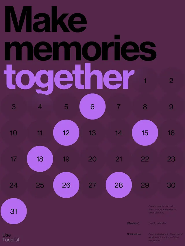
An event calendar interface with 'Make memories together' headline, bright purple numbered circles (1-31) on dark purple background, and small text blocks for features at bottom.
Summary
A product mockup for a calendar app, using bright magenta numbered circles on a dark purple ground to represent a month-view grid with the phrase "Make memories together" as focal headline.
Visual description
The design uses a vertical composition with a large bold headline in two colors: black text reading "Make" and bright magenta text reading "memories together." Below, a grid of 31 numbered circles in bright purple/magenta (varying sizes) are scattered on a dark purple background, clustered loosely to suggest a calendar layout without rigid alignment. Small text at bottom right explains features: "(Meetups)", "Event Calendar" with subtext in subdued purple, and "Notifications" with secondary information. Clean sans-serif typeface throughout, with generous whitespace reinforcing the minimal aesthetic.
Key takeaway
Using playful size variation in a numeric grid to create visual interest while maintaining clear hierarchy. The two-tone headline creates entry contrast (black + magenta) that guides the eye downward. The muted feature descriptions at bottom don't compete with the calendar focal point, keeping the design uncluttered.
Reuse notes
Strong pattern for event, scheduling, or task-management product interfaces aimed at social or community use. The bright accent color against dark background reads as energetic and inviting without feeling chaotic. Size and color variety work well when you need to highlight key dates or features while showing a complete month overview.
More like this
Keep what you find
A free account saves references to boards and can send you a weekly email of picks based on what you save.
To see every result, go Pro.