Preview image. Unlock full-res
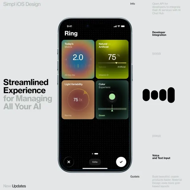
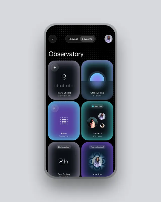
Dark-mode iOS health app dashboard featuring a 2x2 grid of gradient-filled metric cards with data visualizations and complementary side navigation.
Summary
A dark iOS health dashboard featuring four metric cards in a 2x2 grid, each with a color-gradient background and distinct data visualization (numeric readout, slider, gauge, or toggle).
Visual description
Dark-mode iPhone interface centered on screen with large gradient cards arranged in a 2x2 grid. Top-left card shows "Today's Metrics: 2.0" centered in white with a subtle audio-waveform visualization below, sitting on a warm gradient of coral and tan. Top-right displays "Natural vs Artificial: 75%" with a horizontal slider and chart below on a vibrant lime-to-yellow gradient. Bottom-left shows a circular gauge for "Light Variability: 75 lx" with a circular progress indicator and label "Norma" in sand and rust tones. Bottom-right has a single large green circular dot labeled "Color Experience: Green" with a frequency-bar visualization underneath on a dark teal-to-green background. Below the grid is a black action bar with X, Edit, and checkmark buttons. Left sidebar text reads "Streamlined Experience for Managing All Your AI" in bold sans-serif. Right sidebar shows "Developer Integration," "Voice and Text Input," and "Guidels" with placeholder annotations.
Key takeaway
The gradient-per-card system gives each metric distinct visual weight and makes the interface feel premium without complexity. The pairing of numeric, analog, and toggle-style visualizations prevents monotony across similar data views. Color coding (warm for wellness, cool for analysis, saturated for interactive elements) guides intent without text.
Reuse notes
Strong pattern for health, fitness, or AI-integration dashboards. Works best with substantial white space around the grid. The dark background is crucial to the gradient cards reading clearly and the glows popping. Not suitable for data-dense or tabular layouts.
More like this




Keep what you find
A free account saves references to boards and can send you a weekly email of picks based on what you save.
To see every result, go Pro.