Preview image. Unlock full-res
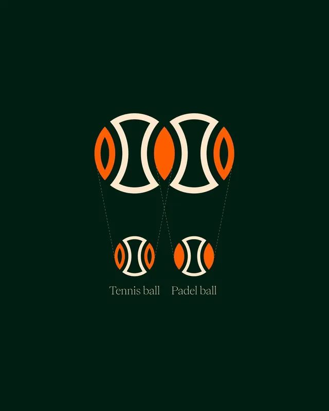
Instructional comparison graphic using paired geometric ball icons to show tennis versus padel ball sizes.
Summary
A vertical instructional graphic showing two ball types (tennis ball, padel ball) through nested geometric icon forms, color-coded orange and cream on forest green.
Visual description
Deep forest-green background with four ball icons arranged vertically in two pairs, connected by light dotted lines forming a loose geometric relay. Each ball is rendered in concentric outlines: outer cream circles, inner bright-orange teardrop or almond shapes with negative space between layers. The pairing structure (two large icons top, two smaller icons bottom) emphasizes relative size. Cream serif label text beneath each lower icon ("Tennis ball", "Padel ball") in a refined, classical serif weight. Symmetrical composition with even vertical spacing and centered axis.
Key takeaway
Nested geometric shapes create instant visual hierarchy without stacking additional elements; the dotted connectors suggest relationship without heavy lines; the two-color scheme (orange and cream) against a dark background achieves high contrast while staying refined; the serif typeface lifts the educational tone from utilitarian to authoritative.
Reuse notes
Ideal for educational materials, sports equipment guides, fitness app onboarding, or any comparison that benefits from clear visual pairing. The symmetrical vertical layout scales well to mobile. The color palette reads as contemporary and approachable; works well in guides, instructional PDFs, or sports marketing.
More like this



Keep what you find
A free account saves references to boards and can send you a weekly email of picks based on what you save.
To see every result, go Pro.