Preview image. Unlock full-res
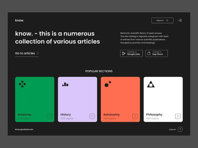
Dark-background landing for a scientific library (know.) featuring left-aligned headline and CTA, app store buttons, and four vibrant category cards with icons and topic counts.
Summary
Dark-mode landing page for an open-access scientific knowledge library, using color-coded cards, simple line icons, and topic counts to guide users into subject areas.
Visual description
Charcoal background with top-right search bar and menu icon. Left side holds the white logo "know." and a bold two-line headline followed by descriptive subtext (describing the catalog as a scientific library, organized by journals and headings). Centered "Go to articles" link with arrow below. Right side shows a smaller description block and two vertically stacked app-store buttons (Google Play, App Store). Below, "POPULAR SECTIONS" label (all-caps, white) precedes four equal-width rounded-rectangle cards in a row: green with a plus-icon (Anatomy, 256 topics), light purple with bar-chart icon (History, 536 topics), coral with dot pattern (Astronomy, 763 topics), white with triangle icon (Philosophy, 689 topics). Each card has a small chevron-arrow icon bottom-right. Footer shows email and support icon.
Key takeaway
Color-coding categories (not just naming them) makes a dense catalog feel navigable at a glance; the consistent card format and topic counts signal completeness and invite exploration; secondary CTA buttons (search + app store) positioned for discoverability without cluttering the hero.
Reuse notes
Effective for educational platforms, knowledge bases, and content libraries where categories need quick visual separation. The card metaphor scales to many more sections if needed. App store links work for platforms with native apps; drop or restyle for web-only.
More like this




Keep what you find
A free account saves references to boards and can send you a weekly email of picks based on what you save.
To see every result, go Pro.