Preview image. Unlock full-res
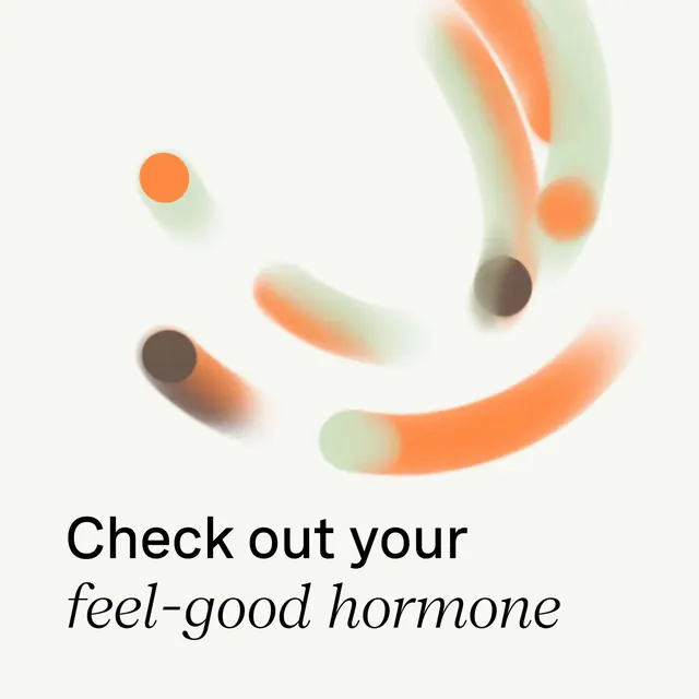
An organic composition of soft-edged gradient circles and brushstrokes in salmon orange and pale green, anchored by healthcare-focused copy below.
Summary
A soft, organic composition of gradient-filled circles and flowing brushstrokes in salmon orange and pale green, supporting a health-focused headline and italicized subtext.
Visual description
Upper half contains a loose cluster of abstract shapes: small solid salmon-orange circles at top-left and top-right, wider wavy brushstrokes in salmon fading into pale green, and soft color gradients suggesting depth and movement. All edges are diffused and anti-aliased, creating a dreamy, non-threatening quality. Lower half features black sans-serif headline text ("Check out your") in a regular weight, followed by italicized subtext ("feel-good hormone") suggesting a wellness or pharmaceutical context. Light gray background provides neutral containment. The overall palette is warm but muted, avoiding harsh saturation.
Key takeaway
The use of soft-edge gradient shapes to express scientific/biological concepts visually without didacticism. The pairing of structured typography (all-caps, regular weight) with flowing, almost watercolor-like graphics. The warm-to-cool gradient direction creates a sense of gentle energy and optimism.
Reuse notes
Ideal for healthcare, wellness, pharmaceutical, or mental-health marketing where you want to feel approachable and emotionally supportive rather than clinical. The abstract shapes read as scientific without being intimidating. Avoid using if the audience needs technical precision or formal credibility. Works well for app onboarding, educational posters, or campaign landing pages aimed at consumer wellness.
More like this





Keep what you find
A free account saves references to boards and can send you a weekly email of picks based on what you save.
To see every result, go Pro.