Preview image. Unlock full-res
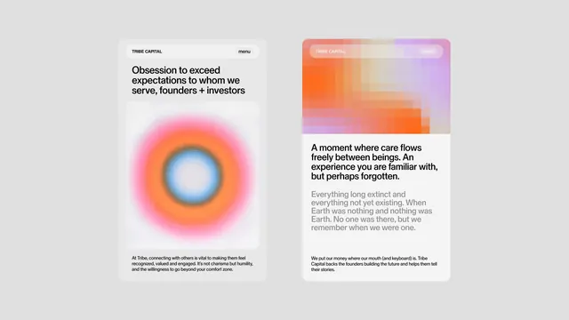
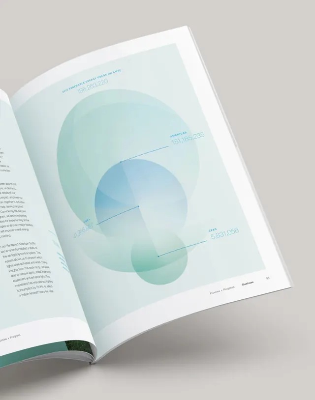
Two minimalist digital panels: left shows concentric warm-orange radial glow on white; right displays a soft coral-to-lavender gradient block topped with empathetic copy about care and connection.
Summary
A refined two-column layout balancing a warm radial glow on one side with a soft gradient and mission-driven text on the other, designed to convey trust and human connection.
Visual description
Left panel: a large concentric radial glow radiating outward from a soft blue core, ringed with warm orange and hot pink, all centered on white. Minimal header and footer text frame the visual. Right panel: a soft gradient block transitioning from coral at top through peachy tones to lavender at bottom, anchored by a bold heading (sans-serif, dark gray) and a paragraph of body copy in a lighter serif. Below, a secondary block of smaller justified text aligns left. Both panels sit on a light gray background, with ample white space and clear typographic hierarchy.
Key takeaway
The radial glow as a focal point without figurative imagery teaches how to draw attention through pure light and color. The soft gradient block pairs well with serious, human-centered messaging. The two-column pairing (abstraction + text) models how to balance visual interest with digestible copy. The serif/sans-serif mix (display and body) adds sophistication without dissonance.
Reuse notes
Ideal for fintech or B2B positioning that leans into empathy and human values. The soft color palette and centered composition feel particularly strong for founder-led or mission-driven brands. The restrained use of gradient keeps it feeling crafted rather than trendy. Could adapt well to investment decks, brand guidelines, or values-focused marketing pages.
More like this


Keep what you find
A free account saves references to boards and can send you a weekly email of picks based on what you save.
To see every result, go Pro.