Preview image. Unlock full-res
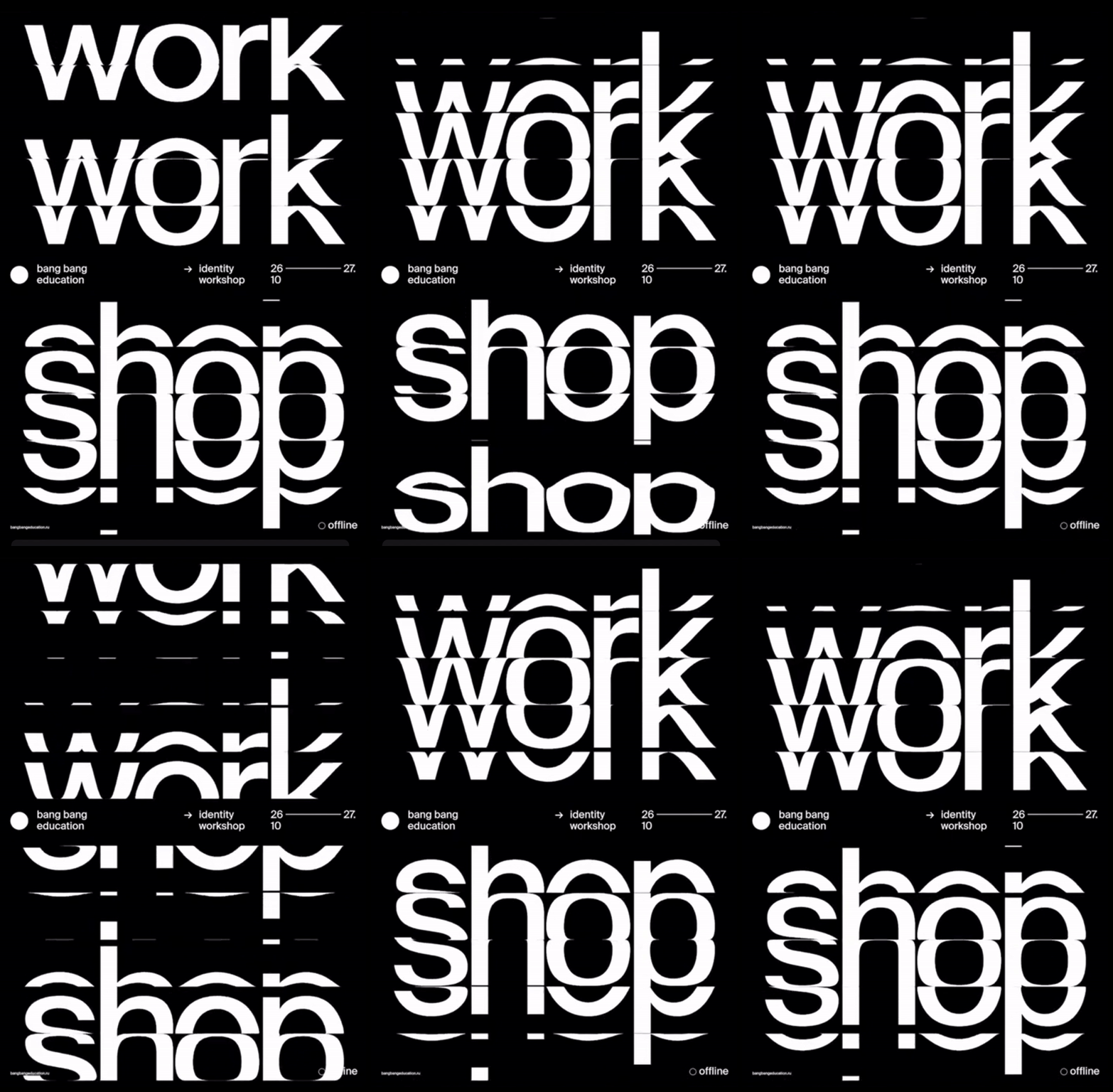
A high-contrast poster for a design workshop with repeated and overlapping sans-serif letterforms in white on black, creating layered depth through letterform intersection.
Summary
A high-contrast poster for a design workshop with repeated and overlapping sans-serif letterforms in white on black, creating layered depth through letterform intersection.
Visual description
Black background with three large words stacked vertically in knockout white sans-serif: "work", repeated twice below it (creating "work work work"), then "shop" in a slightly larger scale at the bottom. The repeated letterforms deliberately overlap and intersect, with the second and third instances slightly offset to create spatial depth and visual rhythm. The sans-serif is geometric with even stroke weight and generous proportions. Below the main type, in white small caps and minimal sans-serif: "bang bang education", an arrow, "identity workshop", dates "26 - 10 - 27", a small white circle, and "offline". The design demonstrates masterful use of negative space and how changing opacity or overlap of identical letterforms creates visual interest without additional illustration.
Key takeaway
The power of repetition with slight offset to create layering in a flat, two-color system. The technique of using type itself as the primary visual language, reducing supplementary design to essential information placed with rigor. The knockout white on deep black produces stunning contrast and legibility at any scale.
Reuse notes
Ideal for educational, cultural, or contemporary art promotion. The brutalist approach signals serious, thoughtful design without compromise. Works at scale (poster, facade signage) and at small scale (event card). Ensure your repeated element is distinctive enough that overlap reads as intentional, not accidental.
More like this
Keep what you find
A free account saves references to boards and can send you a weekly email of picks based on what you save.
To see every result, go Pro.