Preview image. Unlock full-res
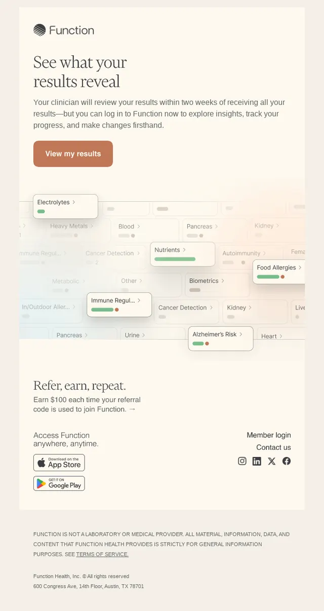
Medical testing app interface displaying personalized lab results through a modular card layout, with test categories and progress indicators on a warm cream background.
Summary
Mobile app screen for a consumer health-testing platform, showing personalized lab results through nested, color-coded cards on a warm, minimal background with a prominent call-to-action button and referral incentive copy.
Visual description
A long-form mobile interface on a warm cream background. At the top, the Function logo (a striped geometric mark) sits above a large serif headline ("See what your results reveal") and descriptive sans-serif copy explaining the user's timeline and benefits. A prominent burnt-orange rounded-rectangle button labeled "View my results" serves as the primary action. Below that, a large interactive map-like grid displays dozens of test categories as individual cards or badges (Electrolytes, Heavy Metals, Blood, Pancreas, Kidney, Nutrients, Biometrics, etc.), many with small green progress bars indicating status. Cards are overlapped and layered to suggest density and explorability. Lower sections include a "Refer, earn, repeat" incentive section and footer navigation, along with app download badges (App Store, Google Play) and social media links. Colors are restrained, favoring the warm background with muted text and selective use of green and red for diagnostic status.
Key takeaway
The overlapping card treatment makes a complex set of lab categories feel approachable and explorable rather than overwhelming. The status-indicator color coding (green for normal, red for flag) is instantly legible without text. Pairing a warm, calm background with a high-contrast action button ensures navigation clarity even in a data-dense layout.
Reuse notes
Ideal for health tech, medical diagnostics, and wellness apps where users need to absorb multiple test results or categories. The layered card approach scales to 20+ items while maintaining visual rhythm. Use sparingly if results demand a more structured, table-like presentation. The warm background lowers perceived clinical coldness, appropriate for consumer-facing health platforms targeting wellness over emergency care.