Preview image. Unlock full-res
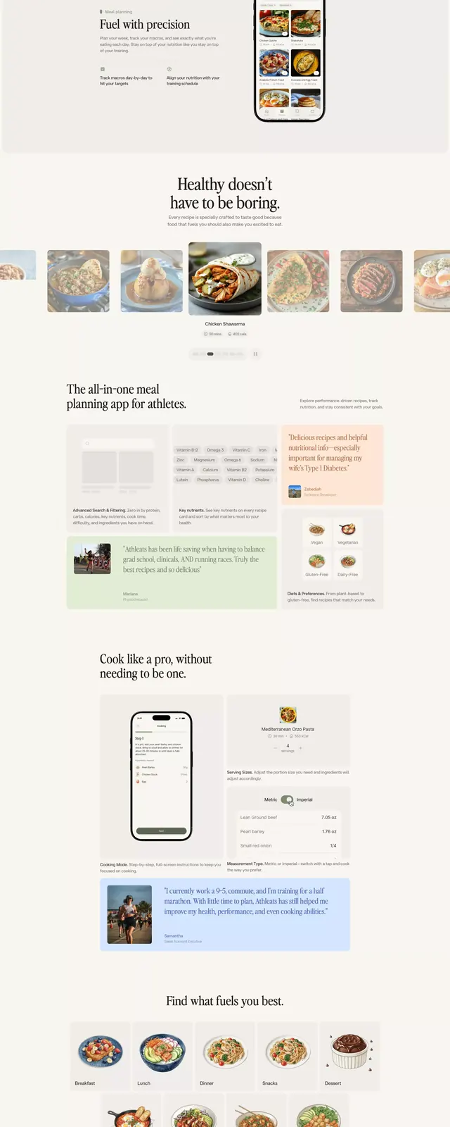
A minimal wellness app interface using warm neutral tones, segmented content blocks, and food photography to organize recipe planning and ingredient management.
Summary
A nutrition and recipe planning app interface organized as a vertical scroll showing segmented content blocks with food photography, ingredient cards, and mobile mockups on a warm cream background.
Visual description
A vertically stacked mobile interface design displayed against a light cream background. The composition features multiple distinct sections: high-quality food photography at the top, followed by recipe cards with ingredient listings in serif serif fonts, a mobile phone mockup displaying the app interface, and content cards showing recipe variations and ingredient groupings. The palette relies on warm neutrals (cream, tan, brown, taupe) with occasional muted teal accents. Spacing is generous, with clear visual separation between sections achieved through whitespace and subtle background tones. Typography mixes clean sans-serif for navigation with serif fonts for recipe content, creating a sense of editorial sophistication. Food imagery remains the visual anchor throughout.
Key takeaway
The content card system allows complex recipe information to feel browsable rather than overwhelming. Warm neutral palette pairs naturally with food photography without competing for attention. The generous horizontal margins and vertical spacing make the interface feel spacious even on narrow viewports.
Reuse notes
Ideal for health, fitness, meal-planning, and nutrition apps. The warm color story works especially well for food brands, wellness products, and subscription meal services. Can feel slower-paced than modern SaaS conventions, better suited to lifestyle rather than performance-focused products.