Preview image. Unlock full-res
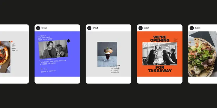
Five stacked card layouts showcasing a modern restaurant or food-service identity system with high-contrast color blocking, photography, and condensed display typography.
Summary
Five stacked card layouts showcasing a modern restaurant or food-service identity system with high-contrast color blocking, photography, and condensed display typography.
Visual description
A horizontal sequence of five equal-width rectangular cards on a black background. Each card uses a distinct approach to layout: white-background cards frame food and portrait photography; a vibrant indigo-blue card pairs a portrait with condensed white type; a bold orange card displays 'WE'RE OPENING' in white caps with a geometric shape; a gray card layers type and imagery; and a cream card features plated food. The system employs strict color separation, minimalist white space, and bold sans-serif display type at varying scales. Circular 'Menu' badges appear at the top of each card. Photography and typography occupy equal visual weight across the compositions.
Key takeaway
The principle of using a card-grid structure to present multiple expressions of a single identity. High-contrast color blocking (white, black, indigo, orange) creates visual rhythm without decoration. Typography is structural, not ornamental: condensed display faces combined with negative space command attention. The system remains cohesive despite variation in content and color per card.
Reuse notes
Excellent for restaurant, cafe, or food-product digital identity systems. The cards work as menu items, social posts, or branded packaging. The photography-forward layout suits brands with strong visual assets. The tight, modern aesthetic appeals to contemporary dining and hospitality. The color palette is distinctive enough to feel premium while remaining approachable for casual food service.
More like this



Keep what you find
A free account saves references to boards and can send you a weekly email of picks based on what you save.
To see every result, go Pro.