Preview image. Unlock full-res
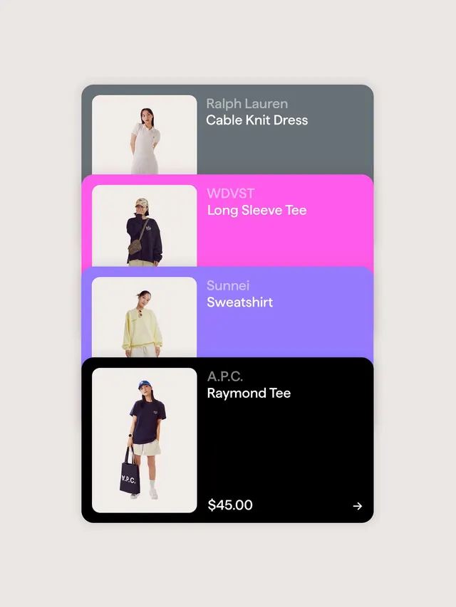
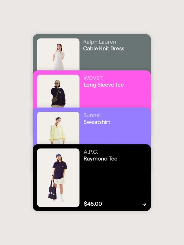
A four-row vertical product stack with square photography cards in white backgrounds, paired with horizontal color-blocked labels (grey, magenta, purple, black) bearing brand names and prices aligned right.
Summary
A four-row vertical product stack with square photography cards in white backgrounds, paired with horizontal color-blocked labels (grey, magenta, purple, black) bearing brand names and prices aligned right.
Visual description
A light grey vertical layout divided into four horizontal product rows, each row containing a left-aligned rounded-corner white card holding a lifestyle product photograph, and a right-aligned color-blocked label area spanning the card height. Row one: soft grey label with "Ralph Lauren" brand and "Cable Knit Dress" product name in white sans-serif type. Row two: hot magenta label with "WDVST" brand and "Long Sleeve Tee" in white type, overlapping the photo card slightly. Row three: periwinkle purple label with "Sunnei" brand and "Sweatshirt" in light text. Row four: black label with "A.P.C." brand and "Raymond Tee" in white, plus "$45.00" price and a right arrow. Each product photo shows a model in neutral pose against white background. Generous white space between rows. Overall impression is sophisticated retail presentation balancing product visibility with brand-color emphasis.
Key takeaway
Color-blocked labels beside (not overlaying) photography preserve product clarity while building brand expression through bold, saturated hue choices. The tiered color progression (grey, magenta, purple, black) creates visual movement down the page and signals premium positioning. The layout ratio (photo 40%, label 60%) prioritizes brand/pricing over product detail, ideal for brand-forward retailers.
Reuse notes
Strong pattern for fashion, apparel, or lifestyle e-commerce platforms emphasizing brand identity over product detail. The neon magenta and purple work best for contemporary, youth-facing, or trend-forward retailers. Price transparency at the bottom works for impulse purchasing. High contrast and clear typography suit mobile viewports. Caveat: label colors may need adjustment if photography is busy or has similar tones.
More like this


Keep what you find
A free account saves references to boards and can send you a weekly email of picks based on what you save.
To see every result, go Pro.