Preview image. Unlock full-res
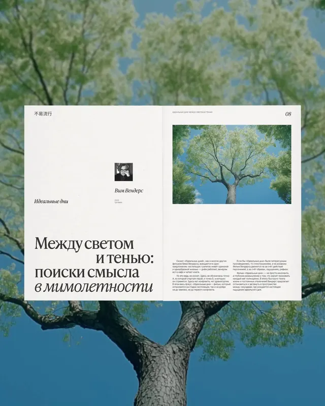
An editorial spread layering Cyrillic typography over large-scale nature photography, combining cool tones and a contemplative visual hierarchy.
Summary
An editorial spread layering Cyrillic typography over large-scale nature photography, combining cool tones and a contemplative visual hierarchy.
Visual description
A magazine spread combines two pages. The left page shows a blown-up tree photographed from below against a blue sky (the full-bleed photography extends across both pages as a background). A white card overlay sits on the left page with a small black-and-white portrait of a man named "Вилл Вендерс" (Wim Wenders), his name in Russian serif type, and a large sans-serif headline in Russian ("Между светом и тенью: поиски смысла в мимолетности") on a light background. The right page displays body text in a justified two-column layout, with the continued nature photography and a cropped detail of the tree visible in a framed rectangle above the text. Cool palette of deep blue sky, muted sage-green foliage, and cream-white editorial card.
Key takeaway
The technique of layering a content card (white, structured, containing type and credits) atop a full-bleed photographic background to establish reading hierarchy without masking the image. The vertical composition that lets the sky anchor the upper half while type and columns organize the lower half. The use of cool forest tones to create mood rather than cheerfulness.
Reuse notes
Strong for literary magazines, art criticism, or cultural journalism layouts. Works best with photography that already has compositional depth (sky, foreground elements). Requires careful color contrast between the white card and the image behind it; test with darker photos. The bilingual/Cyrillic approach is culturally specific; adapt typography language as needed.
More like this

Keep what you find
A free account saves references to boards and can send you a weekly email of picks based on what you save.
To see every result, go Pro.