Preview image. Unlock full-res
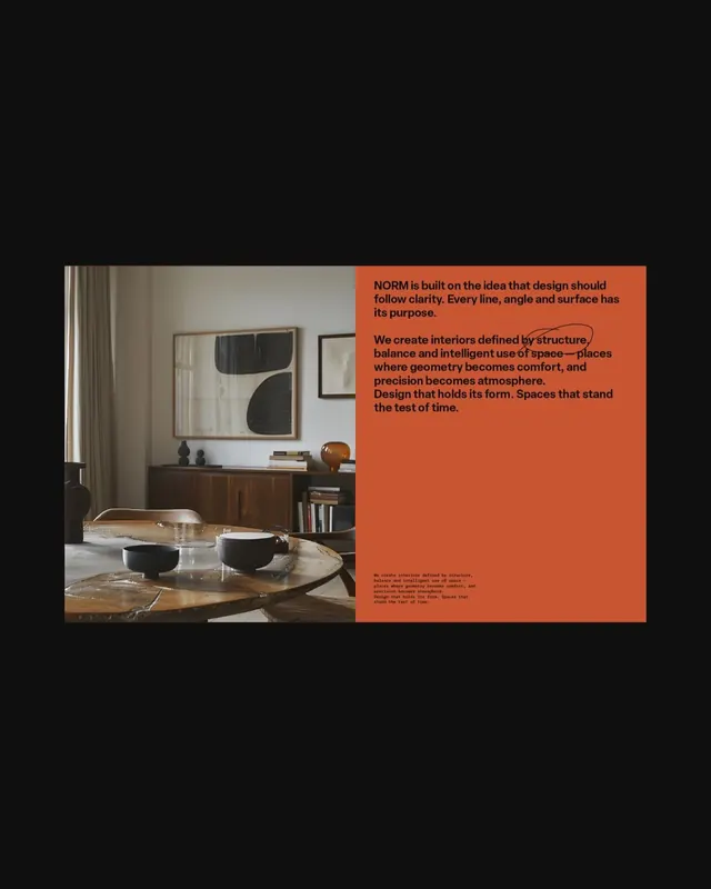
Split-composition design manifesto poster pairing lifestyle interior photography with bold rust-orange text panel articulating design philosophy about structure and clarity.
Summary
Interior design studio manifesto poster with a split layout: residential lifestyle photograph on the left side paired with a bold rust-orange text panel on the right containing philosophy statements about design clarity and structural integrity.
Visual description
Horizontal composition split vertically. Left: interior photograph of a minimal living space with warm wood furniture, decorative objects, and geometric wall art above a wooden credenza. Right: rust-orange solid color field occupying roughly half the spread, with large black sans-serif type stating "NORM is built on the idea that design should follow clarity. Every line, angle and surface has its purpose." and follow-up paragraph in smaller type describing their design approach. Small repeated text at bottom right in reduced size. The photograph and text block create a strong figure-ground relationship with the warm-toned interior echoing the orange panel's warmth.
Key takeaway
The stark compositional split between image and text as a way to frame brand values; the single saturated accent color commanding attention without competing with photographic content; the clear hierarchy where philosophy statement leads and descriptive body text trails.
Reuse notes
Effective for design studio, architectural, or interior brand identity pieces emphasizing philosophy over product. The split layout works for any industry wanting to pair aspirational imagery with a manifesto statement. Best when the accent color bridges the mood of both halves.
More like this

Keep what you find
A free account saves references to boards and can send you a weekly email of picks based on what you save.
To see every result, go Pro.