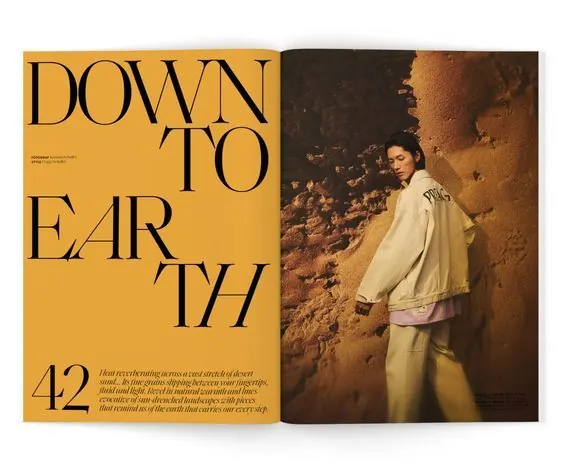
Preview image. Unlock full-res
Magazine spread pairing bold seriffed headline type on gold with warm-toned portrait photography on an adjacent page.
Summary
A magazine spread pairing bold seriffed headline type on a warm gold ground with portrait photography on an adjacent page, creating asymmetric editorial rhythm.
Visual description
Left page features the word "DOWN TO EARTH" in large serif type, split across three stacked lines, in black on a gold/mustard background. Bottom-left corner shows the issue number "42" followed by body copy in smaller serif. The right page is a warm-toned portrait of a person in cream clothing against a russet-toned textured wall. The split-page approach creates visual tension between typographic and photographic elements.
Key takeaway
The bold serif headline broken across lines with irregular white space creates sophisticated visual rhythm. The stark background color (solid gold vs. complex photography) balances asymmetry and guides the eye across the spread. The serif typeface choice conveys editorial authority and timelessness.
Reuse notes
Strong for editorial layouts, magazine covers, or content-heavy layouts where typography and imagery need to coexist without competing. Works well when the secondary image carries context/mood and the headline drives impact.
More like this
Keep what you find
A free account saves references to boards and can send you a weekly email of picks based on what you save.
To see every result, go Pro.