Preview image. Unlock full-res
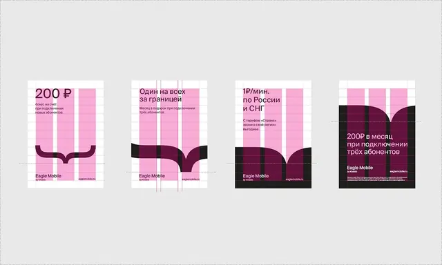
Four promotional pricing cards for a mobile carrier, stacked vertically in a 2x2 grid, featuring price tiers, pink geometric columns, and dark accents with Russian language copy.
Summary
Four promotional pricing cards for a telecom provider arranged in a 2x2 grid, each layering bright pink geometric columns over a dark footer panel containing price, offer text, and branding.
Visual description
Four identical card templates stacked in a 2x2 layout on a light gray background. Each card measures roughly 180x280px. The layout divides vertically: a light top panel (mostly white with pink accents) holds the price tier and descriptive copy in Russian sans-serif; a dark brown/black footer anchors the brand "Eagle Mobile" and domain. The distinctive pattern is a tall pink geometric bar occupying the card's center, crossed by 3-4 lighter pink columns. A curved dark brown accent arch sits at the base of the bright section, creating visual separation from the dark footer. Typography is clean, modern sans-serif; the price figure is bold and oversized. Minimal copy, high readability.
Key takeaway
The stacked geometric columns create visual interest without ornament; the curved dark shape (both practical divider and design detail) gives the template personality. The tight 2x2 arrangement fits many offers in a compact space while each card remains distinct.
Reuse notes
Strong pattern for service-tier or pricing comparisons where multiple plans fit a single viewport. The pink-and-dark contrast is bold; works well for fintech or telecom brands. The Russian text is integral; adapt to your language/region.
More like this





Keep what you find
A free account saves references to boards and can send you a weekly email of picks based on what you save.
To see every result, go Pro.