Preview image. Unlock full-res
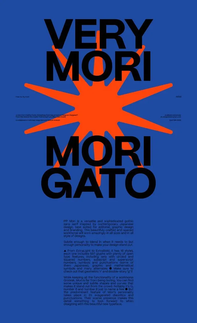
PP Mori gothic typeface specimen poster with a large orange starburst figure punctuating centered text on a deep blue field.
Summary
PP Mori typeface specimen poster with black condensed sans-serif lettering flanking an orange geometric starburst centered on a deep cobalt ground, specimen text in small justified columns below.
Visual description
Vertical rectangular composition on a solid deep blue background. Three elements dominate the layout: the word "VERY" in black caps at top, "MORI GATO" in black stacked letters in the lower half, and a large orange starburst figure with eight radiating rays centered between them. The starburst has smooth, slightly curved edges. Small paragraphs of specimen text in black sit at the bottom in narrow justified columns. Tiny white text in the corners (maker mark, date, and URL). The typeface itself is a bold, contemporary gothic sans-serif with uniform weight throughout.
Key takeaway
The starburst as a visual divider that connects and separates text blocks without lines or boxes. The forced symmetry and color brutality (one complementary pair: cobalt and safety orange) making a sparse layout feel confident. The specimen text typeset in columns underneath the logo, not floated aside, creating a unified single-column reading order.
Reuse notes
Works for type foundries, design studios, conference identities, or any project needing to assert visual confidence through color and geometry. The starburst is highly recognizable and reads as modern/constructivist; use when a single marking is needed to anchor or energize a space. Oversized sans-serif letters and small specimen text is a classic hierarchy; replicable across any font or brand.
More like this


Keep what you find
A free account saves references to boards and can send you a weekly email of picks based on what you save.
To see every result, go Pro.