Preview image. Unlock full-res
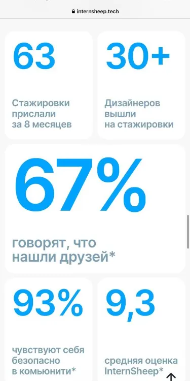
Minimal tech statistics dashboard with oversized bright blue numbers, muted blue subheadings, and paired percentage comparisons on clean white cards.
Summary
Minimal tech statistics dashboard with oversized bright blue numbers, muted blue subheadings, and paired percentage comparisons on clean white cards.
Visual description
A Russian-language tech dashboard with four prominent metric cards arranged vertically on a stark white background. At the top: a two-column card showing "63" (internships) and "30+" (designers). Below, a large "67%" stat with a caption "say they found friends." Bottom row: "93%" paired with "9.3" (average rating). Each number uses bright cyan-blue sans-serif type (around 48-64px), and captions are set in muted blue-gray sans-serif (8-12px). Light gray dividing lines separate cards. The design prioritizes hierarchy through scale and color contrast only, with no additional ornamentation.
Key takeaway
The extreme scale differential between the stat (oversized) and its caption (tiny) creates instant hierarchy and visual interest without color variation. Pairing related metrics side-by-side (count + percentage, raw number + rating) tells a complete story in minimal space. The single blue accent color applied consistently to all numbers unifies the dashboard.
Reuse notes
Best for SaaS dashboards, onboarding metrics, or community impact statistics where you need fast comprehension of multiple related stats. Works with any number set; localize the captions. The muted blue-gray captions prevent color fatigue on white backgrounds with bright accent numbers.
More like this

Keep what you find
A free account saves references to boards and can send you a weekly email of picks based on what you save.
To see every result, go Pro.